This is LB Weekly – our weekly report, which covers the trends and the staying power of the trends. It is part of a LeavittBrothers.com subscription or can be subscribed to by itself at LeavittBrothers.net.
—————
Not a Leavitt Brothers subscriber but appreciate our work? Consider making a small donation.
—————
———————————————————-
The market is confusing right now. It’s not making a lot of sense. It’s doing weird things – things that seem random and sudden and chaotic.
The indexes are split – some moving up, some moving down. During good or bad times they tend to move together – not exactly together, but at least on the same side of the 0 line. Not now.
Stocks are also moving opposite. When viewing the overall market, stocks always move all over the place, but when viewing groups, they tend to stick together. A rising tide does raise most ships. This isn’t happening either.
When the market is healthy and hinged, a good number from one semiconductor stock will often lead to most stocks in the group doing well. Or a good number from a retailer causes all retailers to move up. Right now gains and losses are compartmentalized, having little effect on the rest of the market or groups.
Google did well with earnings. That should help all advertising-based stocks, right? It didn’t. Facebook did poorly. That should hurt social media stocks, but it didn’t. Intel moved down after earnings; AMD moved up. Correlation is very low.
Historically about 50% of a stock’s movement is due to the overall market, and about 25% is due to the group it belongs to. The reality is most companies are parasites – they just feed off the economy and market. If the economy is doing well and there’s demand for whatever sector of the economy they do business in, they’ll come along for the ride. If the group is weak (apparel retailers for example), stocks will suffer. Very few companies are great on their own. Very few companies can grow and expand and innovate and be great in a vacuum, independent others and outside forces. Amazon is the best example of a company that walks to the beat of its own drummer, but there are few AMZN’s out there.
Because of this, because of the tendency to move with the market and group strength/weakness – except at a faster or slower rate – a first step in choosing trading candidates is the trend of the market and a discovery of the leading/lagging groups. If you have these two forces on your side, you can almost randomly pick stocks and beat the market by a pretty good amount. Add in a little experience choosing the top performers, and beating the market by a wide margin is doable and realistic.
But what happens when the market becomes unhinged? What happens when the indexes move randomly relative to each other? It’s been common recently for an index to move up 0.75% while another moves down 0.75% on the same day? And what happens when stocks that typically move together suddenly get divorced and reveal they have nothing in common? Our first step mentioned above gets thrown out. Instead of picking the best stocks in the best groups, knowing we have a gentle breeze at our backs, we’re stuck picking the best stocks. Period. Just the best stocks that have to be great on their own instead of getting to mooch off the strength of its peers. Like I said, there aren’t many Amazons out there.
This seems to be the state of things right now – a confusing market that is void of normal characteristics. But complaining is like a surfer complaining about the waves being offered. It makes no sense. The ocean is what it is. The opportunities offered at any given time or during any given period are what they are. Pick your spots and ride them or stand on the beach and wait. There is no sense complaining and harboring any negative thoughts. Poker is similar. Play the cards you’re dealt or fold. So is trading. Recognize the character of the market and what it’s offering. Then play it or sit out.
During a year, you’ll sit out one-third of the time – or at least your exposure will be significantly reduced. It’s very important to not dig yourself a hole during the bad times so that when a good time comes, you’ll be able to build your account above its high water mark, not dig out of a hole.
If you don’t like this market, don’t fight it. It’s okay to back off and wait for a better time. It’s okay to wait for the indexes to get on the same page and groups to move more in sync. Waiting is hard, but it’s very important. You don’t want to take too big of a step backwards. Your account will take a hit; your emotional energy will drop; and you’ll be a little gun shy when opportunities improve. Then you’ll under trade and not fully take advantage of the situation.
Two weeks ago I said the market was messy. It still is. Don’t force trades. Let’s get to the charts and see what they say.
Indexes
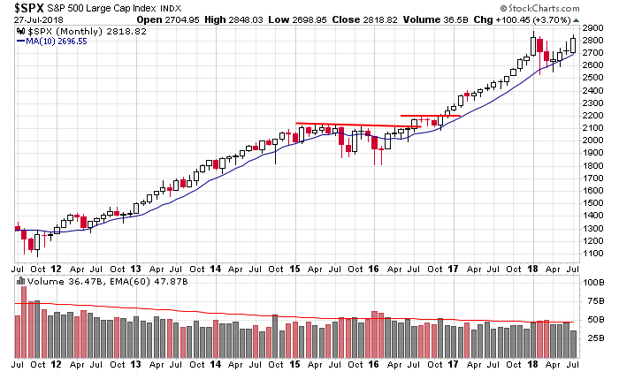
The S&P 500 Monthly: Two more trading days to go this month. What happened to “sell in May?” As of now July will post a big gain. Long term the market is in great shape.
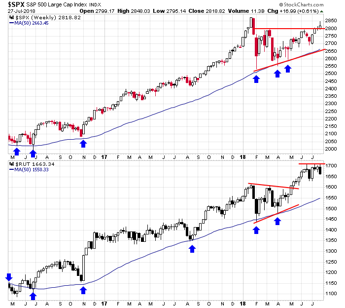
The S&P 500 & Russell 2000 Weeklies: The S&P took out a resistance level on its weekly but couldn’t hold the early-week follow through last week. The Russell reinforced its weekly resistance. These are long term charts. As long as they remain above their 50-week MAs, I’ll consider the trends to be up.
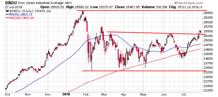
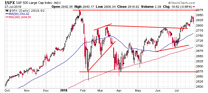
The Dow and S&P 500 Dailies: The Dow took out two previous highs (barely) but got no follow through. The S&P got pretty darn close to its all-time high and then pulled back hard on Friday. The Dow is neutral – it’s been like this for 6 months. The S&P is trying to turn up but overall would be considered in a consolidation range going back to mid November. When you zoom in with this time frame, the market lacks direction, but per the monthly and weekly charts above, this period should be considered a rest within a long uptrend.
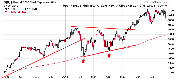
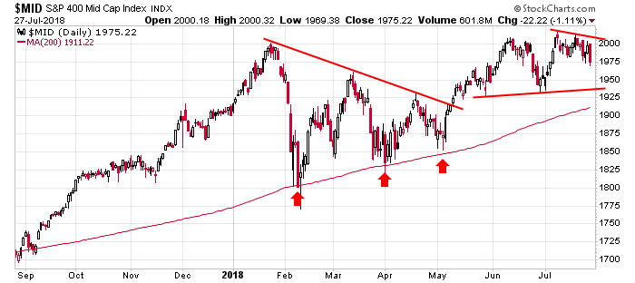
Russell 2000 and S&P 400 Dailies: Friday’s big down day doesn’t destroy the beauty of the Russell daily. Charts don’t get much better than this. The S&P mid caps are doing just fine too. As long as the 200 holds (if the index even gets there), the long term remains in place. There are no warnings signs here. The market is in good shape.
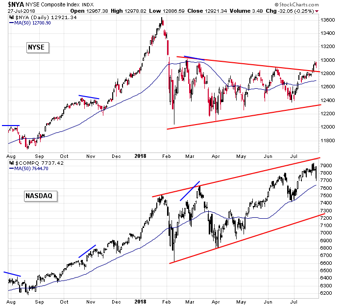
NYSE and Nasdaq Dailies: The market performs best when the NYSE and Nas move together, matching each other’s higher highs, etc. On a short term basis, they got back on track last week, but overall they’re still way off. The NYSE matched its late-February high but got no further. It’ll take a while before these two are moving together long term.
Indicators
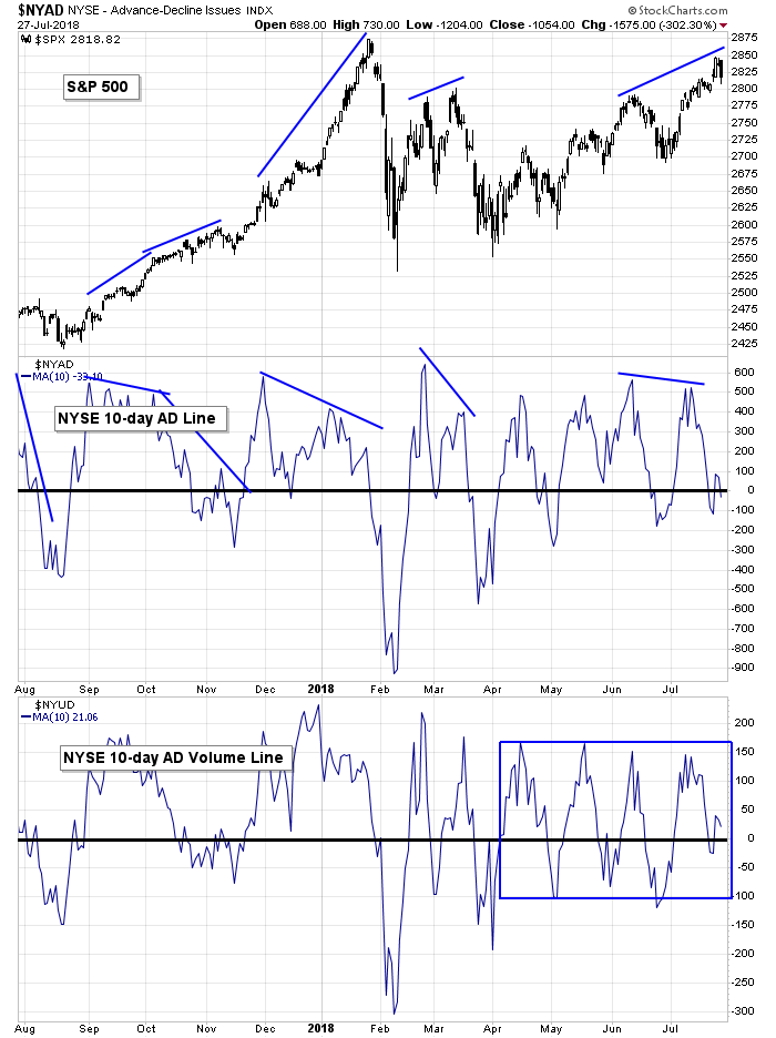
S&P 500 vs. 10-day MA of NYSE AD Line & 10-day MA of NYSE AD Volume Line: The divergences are getting more extreme. Not only could the 10-day of the NYSE AD line and AD volume line not match the higher high from the S&P, they’re hovering around 0. Until Friday the S&P was up about 40 points over the previous 10 days, but both these indicators suggested a complete lack of participation. It’s not the end of the world. Previous lows haven’t been taken out, but weak breadth is starting to take a toll.
S&P 500 vs. NYSE Cumulative AD Line & NYSE Cumulative AD Volume Line: The longer term cumulative AD and AD volume lines remain in uptrends, so there’s no hint Friday’s pullback will lead to anything but a minor correction. These are among my top indicators. They’ll roll over before the market does. As of now it’s not happening.
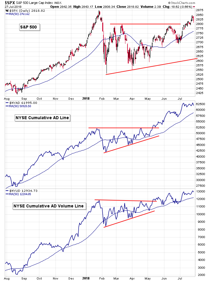
Large, Mid & Small AD Lines: The AD lines of the mid caps and small caps put in lower highs last week while the large cap version printed a new high. I consider the divergence to be minor. Overall these charts are doing great and don’t suggest any intermediate or long term issues.
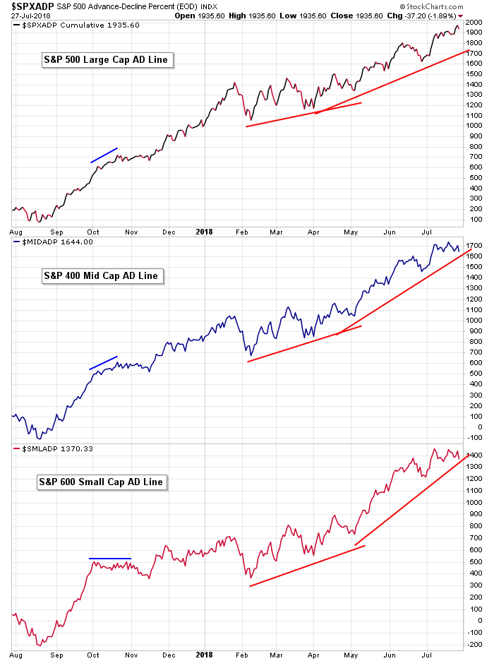
Large, Mid & Small AD Volume Lines: The divergence between the small and mid caps AD volume lines is a little more pronounced, but the overall picture still looks very good. As of now there’s no reason to believe a big correction is brewing.
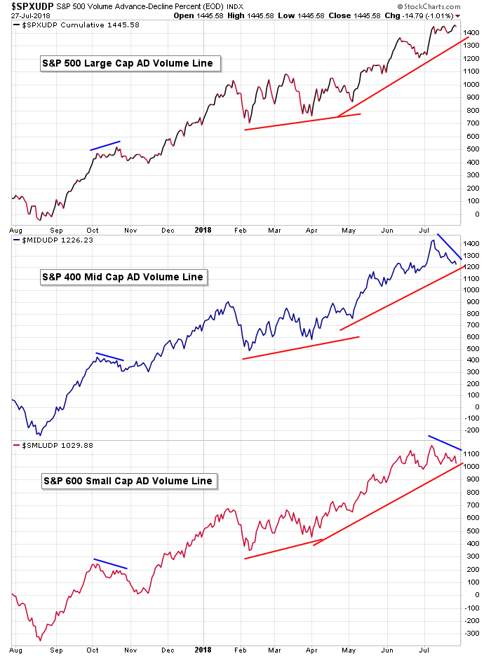
S&P 500 vs. NYSE New Highs & NYSE New Lows: New highs have lagged all year. It’s been the single biggest thorn (warning) in the market’s side. An inability to print a higher value here has kept the overall market in check. There is no chance the market sustains a rally from the current level without new highs at the NYSE breaking out of the blue box drawn.
S&P 500 vs. NYSE New Highs – New Lows: Despite new highs not being very robust, with new lows being nonexistent, the high-low differential remains comfortably above 0. This tells us the market’s overall health is good, although it’ll need to improve to support a rally from these levels.

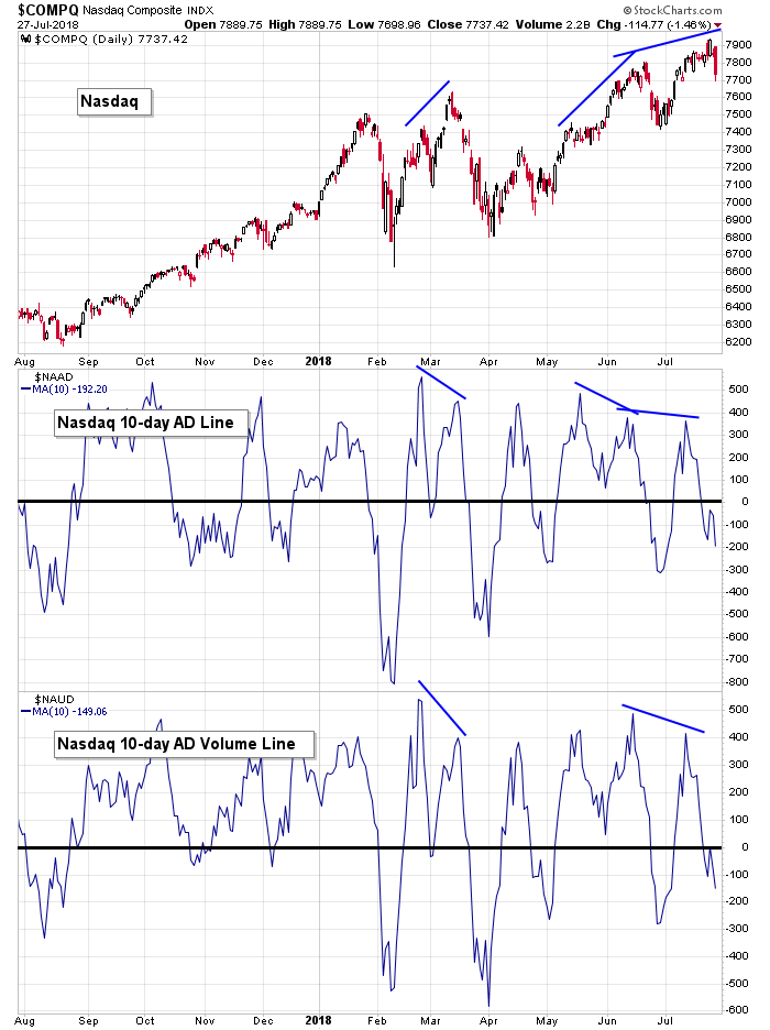
Nasdaq vs. 10-day MA of Nas AD Line & 10-day MA of Nas AD Volume Line: The 10-day of the Nas AD and AD volume lines are worse off than the NYSE versions. Not only have they failed to match the movement of the underlying index, they’re both below 0. The Nas has gone up, but there has been more decliners than advancers the last two weeks. Friday’s action shows us this can’t last.
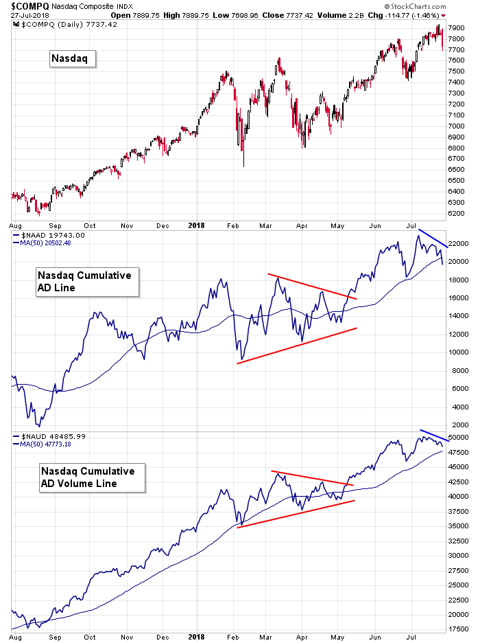
Nasdaq vs. Nasdaq Cumulative AD Line & Nasdaq Cumulative AD Volume Line: With prints below 0, the cumulative Nas AD and AD volume lines are moving down. There are no major warnings here. They haven’t been trending down for long, so I don’t fear the market’s overall health is in jeopardy. But in the near term it hints at a lack of support.
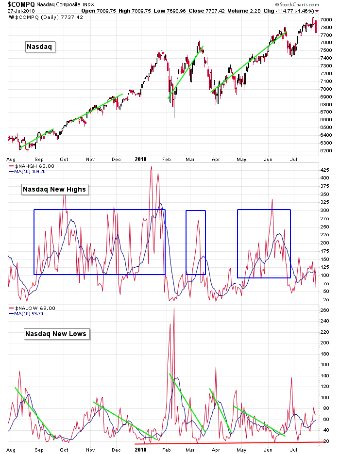
NASDAQ vs. NASDAQ New Highs & NASDAQ New Lows: New highs at the Nas have also been lagging severely. The index printed an all-time high last week, yet new highs among individual stocks can’t even print a respectable number. Some allowance is okay because Google, Amazon, Facebook, Microsoft, Apple and others are equivalent to dozens (perhaps hundreds) of smaller companies. Still, improvement is needed here.
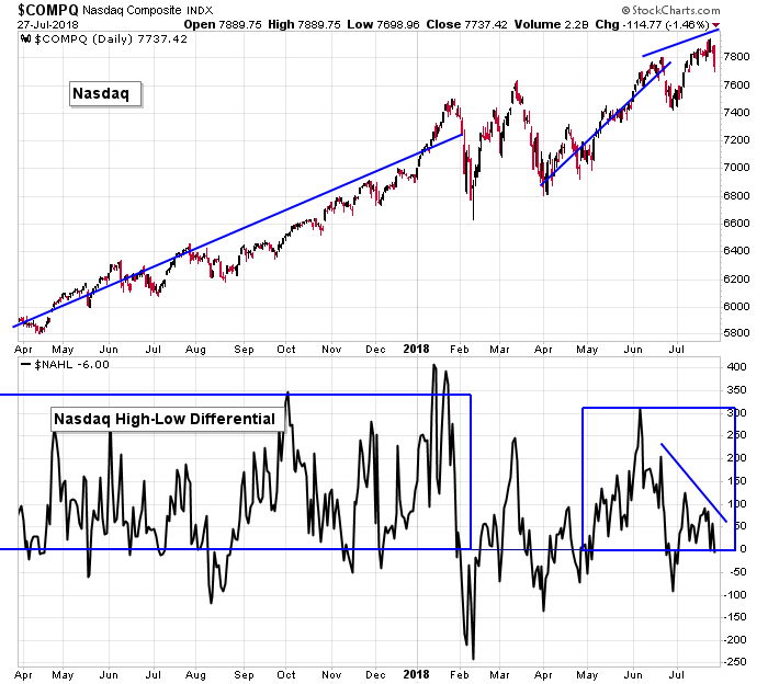
NASDAQ vs. NASDAQ New Highs – New Lows: The high-low differential at the Nas has been trending down while the Nas has trended up. A short-term disruption – not necessarily anything major – is needed for the charts to reset.
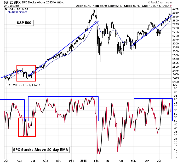
S&P 500 vs. Percentage of SPX Stocks Above 20-day MA: The percentage of SPX stocks above their 20-day MAs has fully supported the market’s series of higher highs and higher lows the last three months. Steady prints above 50% are needed to give the upper hand to the bulls.
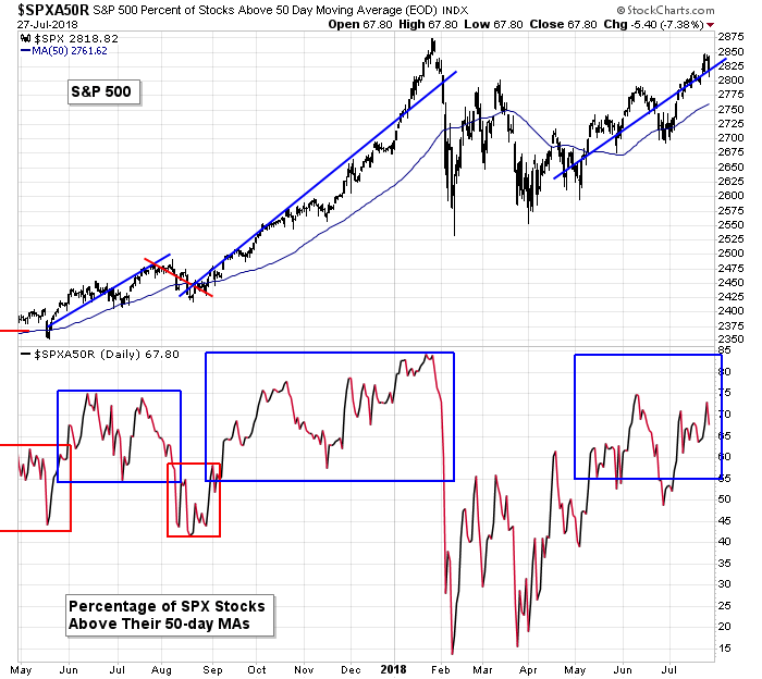
S&P 500 vs. Percentage of SPX Stocks Above 50-day MA: Backing up a bit with the 50, we have pretty good support here too. Higher prints would be nice, but as long as more than 55% of SPX stocks are above their 50-day MAs, the bulls will have the upper hand.
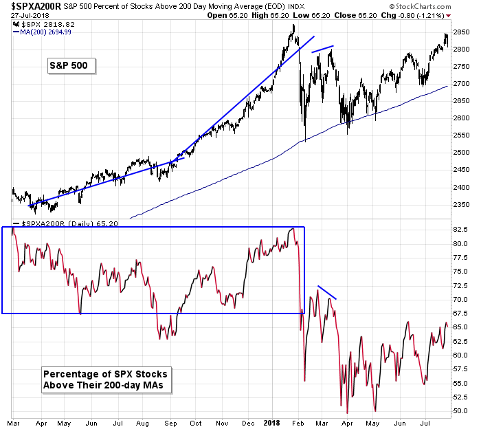
S&P 500 vs. Percentage of SPX Stocks Above 200-day MA: Backing up one more time, we still have a lack of support from the percentage of SPX stocks above their 200’s. The market does best when the print is in the mid-to-high 60’s or higher. It hasn’t been that high for four months. There are a lot of stocks that can’t reclaim this simple long term moving average. This is a big reason the S&P has moved up the last couple months but can’t build momentum and move up with force.
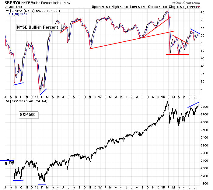
S&P 500 vs. Bullish Percent at the NYSE: The S&P moved to a higher high while the NYSE bullish percent put in a lower high. The indicator is sitting at a respectable level, so the divergence only has near-term implications.
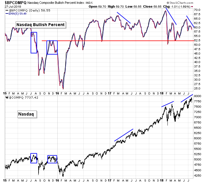
Nasdaq vs. Bullish Percent at the Nas: Ditto for the Nas – higher high for the index, lower high for the bullish percent. The market doesn’t need to correct a lot or for long, but a pause would be healthy.
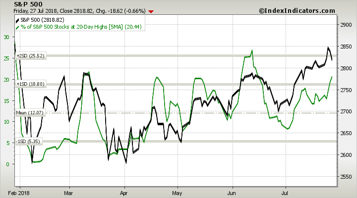
S&P 500 vs. Percentage of SPX Stocks at a 20-day High: Surprisingly, despite the market’s big plunge on Friday, the percentage of SPX stocks that touched a 20-day high jumped to its highest level since mid June. Not bad. It’s still below the June highs, but at least it’s moving in the right direction.
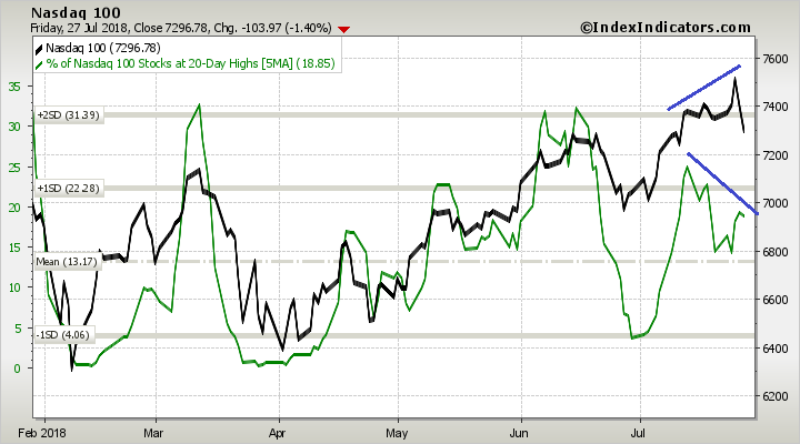
NASDAQ vs. Percentage of Nasdaq 100 Stocks at a 20-day High: The Nas 100 hit a new high last week, yet the percentage of NDX stocks printing a 20-day high put in a lower high (again). This is a definite lack of support and a major black cloud that hangs over the market.
The Bottom Line
Long term the market is in great shape. The index charts are trending up and doing just fine, and the longer term indicators still fully support the trend.
Short term there’s been a growing lack of support. The AD lines and AD volume lines have fallen off and new highs remain at low levels. This type of weak breadth weighs on the market internally and will either chock off upside gains or pull the market down, as it did Friday.
Overall the long term trend is solid. I fully expect new highs to be made and the rest of 2018 to be good for stock holders. But short term the market has become unhinged and is very messy. Time is needed for the charts and indicators to reset. And considering it’s summer and earnings season, it may not be a bad time to lay low. There isn’t a good reason to be super aggressive.
Have a great week.
Jason Leavitt
4 thoughts on “LB Weekly (Jul 29)”
Leave a Reply
You must be logged in to post a comment.
Great post and explanations.
I am a big picture trader. So monthly is what I look at first. There is no sign of a long term Top. I suspect that will come in the next couple years. But I do think when we see a break out on the SPX above the January 2018 Top, we will see a real strong rally way above where most are thinking.
Love these weekly posts! Great work!
I agree Alan. The long term looks great, and when the market does leg up, it’ll be a lock-out rally, meaning it’ll go up day after day and not let anyone in who isn’t already in.
Great post.
I cannot find a period in time where the NASDAQ went down and the RUT went up. There are many occurrences in bear markets where the NASDAQ does go down significantly harder that the RUT. The one that comes to mind are the 5 weeks prior to 911 where Nas lost 20 and the RUT lost only 10. Back then I sensed something was about to happen. (I expected a market bounce.) Was I wrong!
I will hold in cash for now.
Opps I mean 20% and 10%.