This is LB Weekly – our weekly report, which covers the trends and the staying power of the trends. It is part of a LeavittBrothers.com subscription or can be subscribed to by itself at LeavittBrothers.net.
—————
Not a Leavitt Brothers subscriber but appreciate our work? Consider making a small donation.
—————
———————————————————-
The most defining characteristic of today’s market is that is lacks conformity.
A rising tide does not raise all ships. Birds of a feather do not flock together. Pick your cheesy one-liner that describes how groups move together and insert the word ‘not’ somewhere in there for a statement that accurately depict today’s market.
The indexes have not just taken turns leading and lagging, they’ve often moved opposite. When the Russell 2000 was hitting a new high, the Dow was moving down and far from its own all-time high. Then the Dow moved vertically up for almost the entire month of July while the small caps aimlessly drifted sideways. The Nasdaq and NYSE have spent time moving opposite overall (Nas at new highs, NYSE nowhere close) and on a week-to-week basis. A rising today is not raising all ships. It’s more like a wave pool, where a high water mark in one part of the pool is countered with a low mark somewhere else.
Groups are always on different pages – that’s at the heart of being a stock picker. Some groups do great; some do well; others do poorly. Money rotates around. Being in the right groups at the right time is the key to out-performing. A diversified portfolio will merely match the indexes, but a portfolio over-weighted in the leading groups can dominate. This is always the case. It’s what makes trading worth it, so there will never be a complaint the correlation between groups is low.
But individual stocks – many of which are similar or seem similar – are in different sides of the pool. Google rallied from 1000 to 1200 and then rallied almost another 100 after earnings. Facebook, on the other hand, got the distinction of shedding the most market cap in a single day after earnings. The stock gapped down 20% and lost a staggering $120 billion in value. Netflix dropped 20% off its high while it was mostly business as usual for Amazon. AMD moved up; Intel moved down. Apple and Tesla did great; Twitter dropped 35% in the two days after earnings. Many consumer-related stocks continue to do well, but Cheesecake Factory and Red Robin got hit hard. It’s normal for stocks to move opposite, but it’s much less common for ‘like’ stocks to move opposite. Normally a good number from Nike would help Under Armour, Lululemon and VF Corp. Not now. Normally a good number from a semiconductor stock would positively ripple through the sector. Not now.
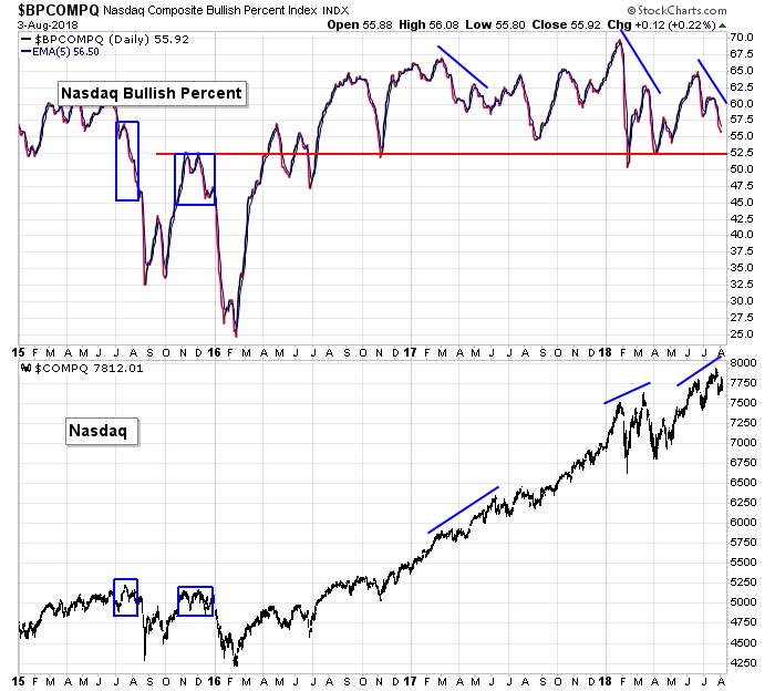
Breadth indicators aren’t singing the same tune either. The percentage of stocks above their 20- and 50-day moving averages are sitting at healthy levels, but the bullish percent charts formed negative divergences and are moving down. New highs at the Nas and NYSE do not support a strong market, but the cumulative AD and AD volume lines are doing great. It doesn’t matter if you zoom in with the number of stocks hitting a 20-day high or back up and consider the number of stocks above their 200-day MAs, different messages are offered. Both the bulls and bears have stuff to lean on.
The net of all this is very sloppy market, so traders have nothing to lean on. They can’t say: Tech is doing well, so let’s be over-weight. Some tech is getting hit hard. The only thing I can point to as being somewhat consistent right now is consumer staples. Not discretionary, old fashioned staples like Coke, Pepsi, Clorox, Church & Dwight and a handful of food-related names, such as Kroger and Campbell’s. Perhaps it’s a hint, or maybe investors are seeing the random chaos and moving to safer waters until the market is more predictable. After all, there are professional money managers who, by law, must be virtually all in the market on the long side no matter what. These investors collectively manage well over a trillion dollars. They can’t rotate between being in and out of the market. But they can cycle between being aggressively long higher beta names and safe havens.
The bottom line is this is not a good trading environment. Everything is at risk. Surprises are happening with greater frequency and in bigger ways. This is not a time to swing for the fences. Bias is definitely to the long side, but scaling back a little and being a little quicker to take profits is wise. Let’s get to the charts and see what they say.
Indexes
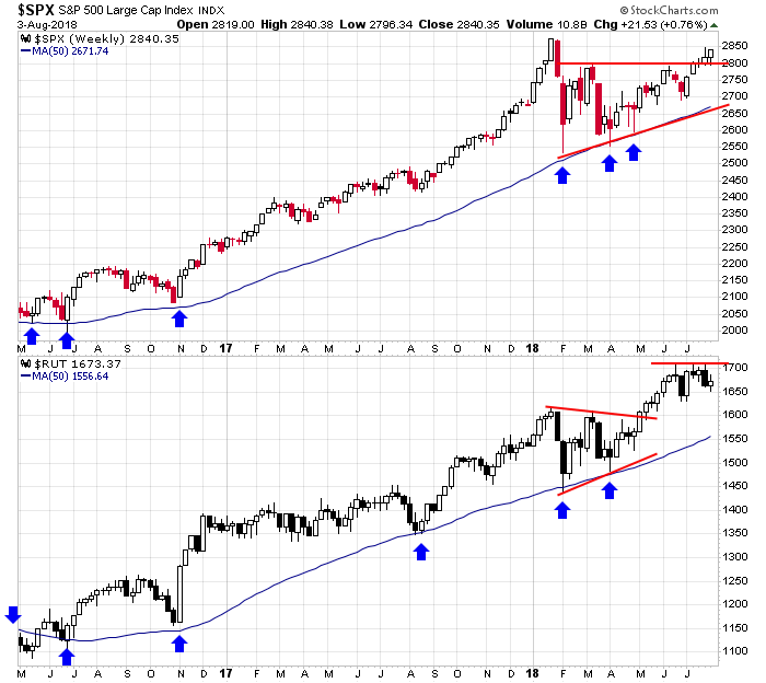
The S&P 500 & Russell 2000 Weeklies: First the Russell 2000 legged up to a new high during May and June, and the S&P stayed within its range. Now the S&P is pressing higher while the Russell rests. Long term both indexes are in fantastic shape and have a big buffer to work with.
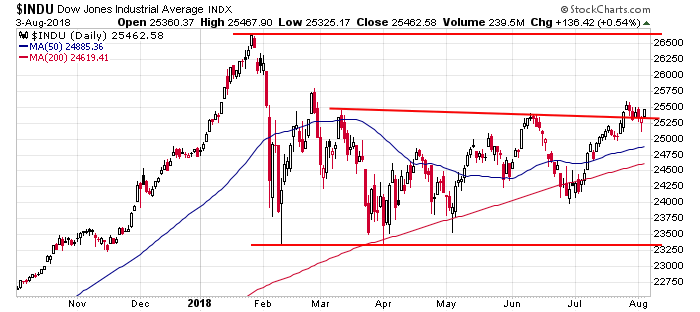
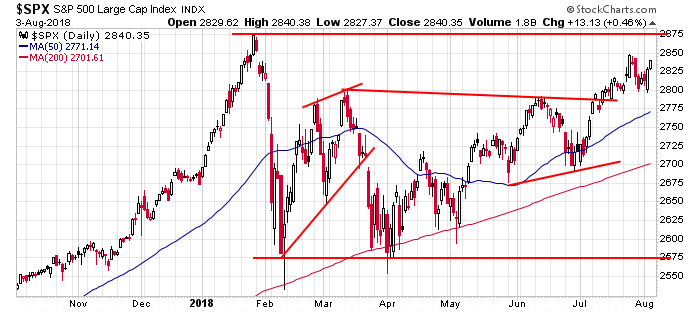
The Dow and S&P 500 Dailies: The Dow took out two previous highs but got no follow through. I consider the index to be neutral. The S&P also took out a couple previous highs and has been able to press higher. With the 50 trending up and the index less than 50 points from its all-time high, it’s stronger than neutral.
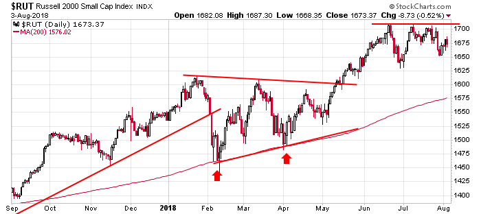
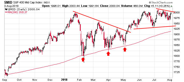
Russell 2000 and S&P 400 Dailies: Despite the Russell failing to take out resistance and then falling below two previous lows, the structure of this overall chart is in fantastic shape. Charts don’t get prettier than this. The mid cap chart is almost just as good. You can’t be anything but bullish and long per these charts.
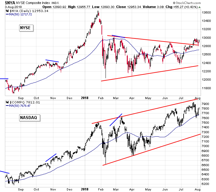
NYSE and Nasdaq Dailies: Tale of two markets. The Nas has been putting in higher highs and higher lows. The NYSE plunged in February, so despite gently stair-stepping up the last couple months, it’s nowhere near its high. Broader participation is needed for the market to accelerate higher upward.
Indicators
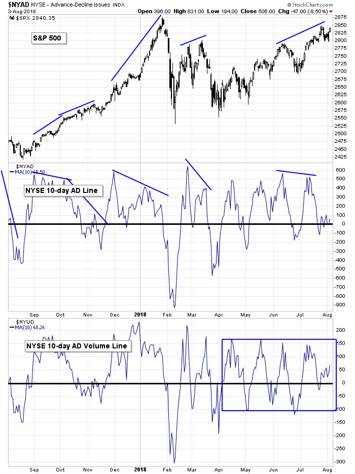
S&P 500 vs. 10-day MA of NYSE AD Line & 10-day MA of NYSE AD Volume Line: The 10-day of the NYSE AD line and AD volume line cycled from the high of their ranges down to 0. This is perfectly normal activity. Within an overall uptrend, there can be mini counter moves. As long as these indicators don’t fall hard, the market isn’t likely to correct much. From here, a rally attempt needs to be accompanied by improvement from both these indicators.
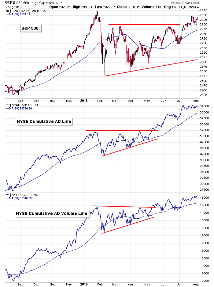
S&P 500 vs. NYSE Cumulative AD Line & NYSE Cumulative AD Volume Line: The cumulative AD and AD volume lines are pausing. The AD is flat over the last month; the AD volume is up slightly. The overall market strength is supported, but short term this indicator is in sync with the market lacking direction.
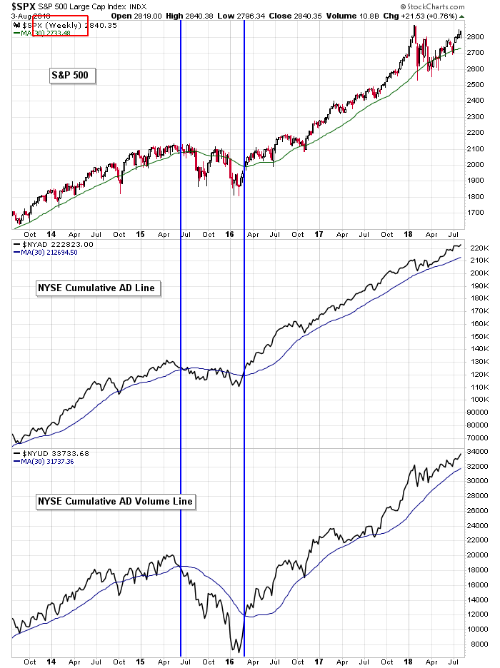
S&P 500 vs. NYSE Cumulative AD Line & NYSE Cumulative AD Volume Line (weekly): The longer term weekly cumulative AD and AD volume lines remain in great shape. These will roll over well before the market tops, and given the distance between these indicators and their up-trending 30’s, there’s no sign of a longer term top.
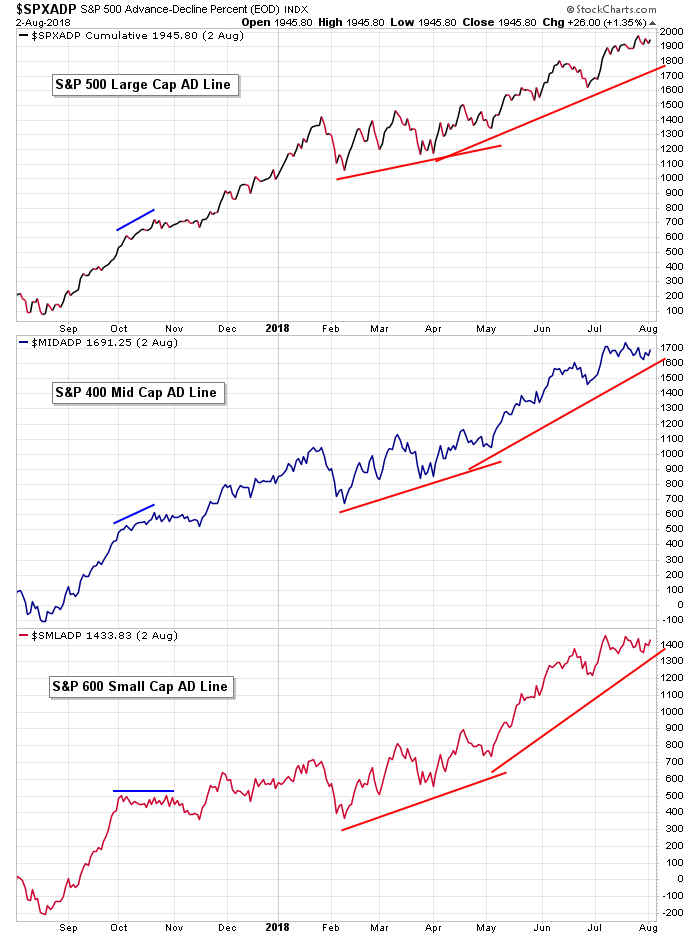
Large, Mid & Small AD Lines: The AD lines of large caps, mid caps and small caps are all trending up overall, but have mostly moved sideways the last month. There are no warnings here. There are no aberrations. These curves are consistent with the market’s movement.
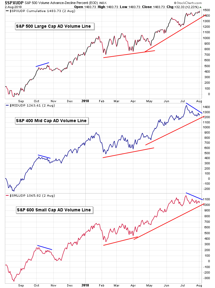
Large, Mid & Small AD Volume Lines: The large cap AD volume line is trying to press higher while the mid cap and small cap versions are moving over and down within overall uptrends. The lack of confirmation from the small caps is notable, given the Russell 2000 is near its high. Nothing alarming. Just a noteworthy development to pay attention to.
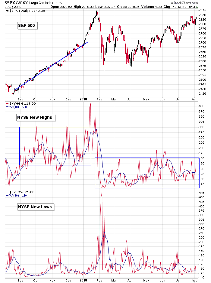
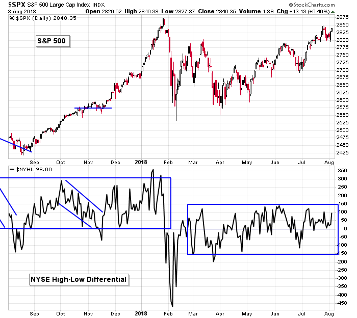
S&P 500 vs. NYSE New Highs & NYSE New Lows: New highs at the NYSE are still lacking. You can see the blue box on the left – that supported the S&P’s strong, 400-point rally. If the index is going to rally up to 3000 and 3200, another blue box that contains higher new high prints on the hard right edge will be needed.
S&P 500 vs. NYSE New Highs – New Lows: The high-low differential at the NYSE continues to comfortably fluctuate above 0, so while new highs don’t support a forceful move up, this indicator doesn’t suggest a stiff move down is in the cards either.
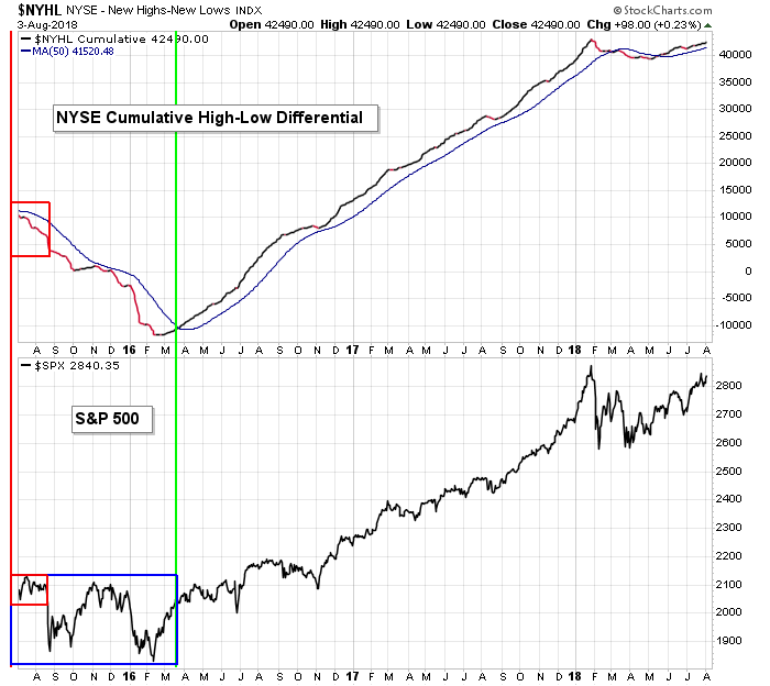
S&P 500 vs. NYSE New Highs – New Lows: The cumulative high-low is slowly moving up. This supports the market moving up but not accelerating up.
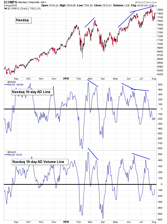
Nasdaq vs. 10-day MA of Nas AD Line & 10-day MA of Nas AD Volume Line: The Nas AD and AD volume lines have also cycled down to their lows. Within an overall uptrend it’s normal for these curves to roll up and down. As long we don’t get a big plunge or failure to move up when the market attempts to rally, we don’t get a warning. The Nas did rally hard last Thursday and is now a few days and 200 points removed from its low. These indicators need to confirm the gains or else the market will reverse.
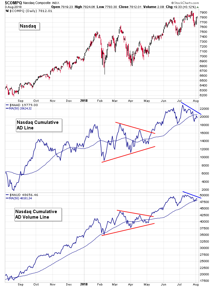
Nasdaq vs. Nas Cumulative AD Line & Nas Cumulative AD Volume Line: The cumulative Nas AD and AD volume lines have moved down the last month. Cycling down within an overall uptrend is normal and healthy. The bulls just don’t want to see a legit downtrend characterized by lower highs and lower lows and a down-trending 50.
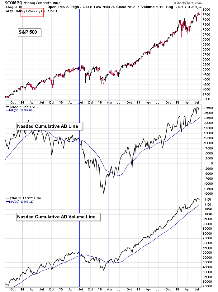
Nasdaq vs. Nas Cumulative AD Line & Nas Cumulative AD Volume Line (weekly): The weekly cumulative AD and AD volume lines remain solidly in their overall uptrends. There are no signs the long term trend will change any time soon. It’ll take several months for these curves to roll over.
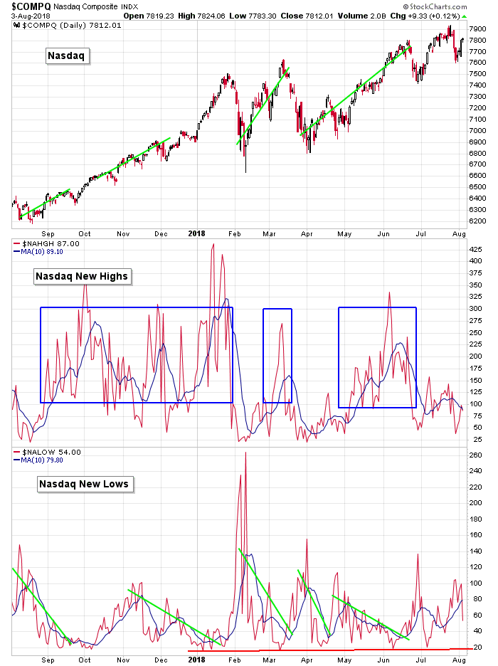
NASDAQ vs. NASDAQ New Highs & NASDAQ New Lows: Like at the NYSE, new highs are lacking at the Nasdaq. In fact they’ve been trending down for two months despite the Nas itself trending up. Something has to give. Short term divergences can be brushed off, but bigger divergences must be dealt with.
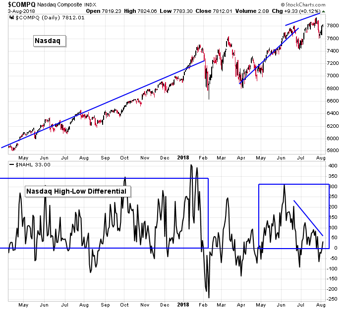
NASDAQ vs. NASDAQ New Highs – New Lows: The high-low at the Nas has been trending down. This has happened in the past (intermediate term divergences, see last October) but there’s always a quick recovery. Look for the same thing now…or there’s little chance the Nas continues up. At some point new highs need to print a high number. Even if they don’t hold, just printing a high number to let everyone know they’re still alive is needed.
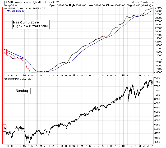
NASDAQ vs. NASDAQ New Highs – New Lows: The cumulative Nas high-low has flattened out but remains in an overall uptrend, comfortably above its up-trending 50.
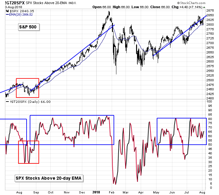
S&P 500 vs. Percentage of SPX Stocks Above 20-day MA: After a brief dip below 50% in late-June and early-July, the percentage of SPX stocks above their 20-day EMAs has sat at a comfortable level in support of a healthy market. As long as the 50% level holds, there is little risk of a big move down.
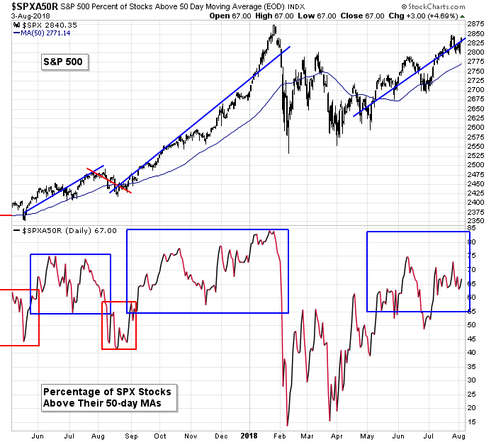
S&P 500 vs. Percentage of SPX Stocks Above 50-day MA: The percentage of SPX stocks above their 50-day MA also supports a healthy market. The 55% level is key here. As long as it holds, the bulls have support.
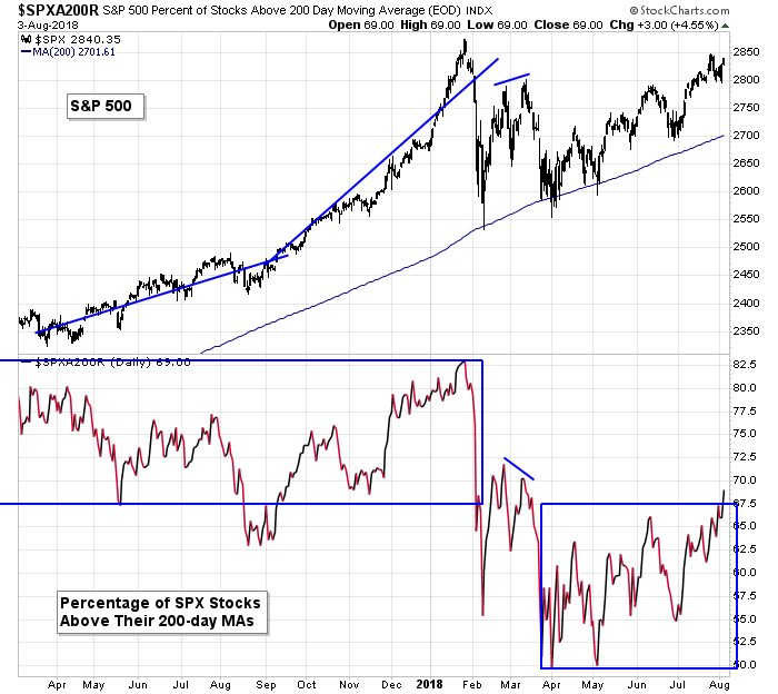
S&P 500 vs. Percentage of SPX Stocks Above 200-day MA: The S&P recently set an all-time record for the number of consecutive days the index has closed above its 200-day MA, yet the number of individual stocks trading above this key moving average has been at relatively low levels most of this year. This will need to change if the S&P is going to ramp up and move into the 3000’s. At least it’s at a 5-month high right now.
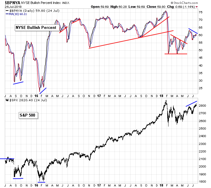
S&P 500 vs. NYSE Bullish Percent: The S&P has formed a short term negative divergence with the NYSE bullish percent chart, but is sitting at a high level overall. The long term is in good shape; short term there’s work to do.
S&P 500 vs. Nasdaq Bullish Percent: Ditto for the bullish percent at the Nas. Short term a divergence has formed and the bullish percent is pointing down, but long term the absolute print is still supportive of a healthy market.
The Bottom Line
The market has become unhinged. The indexes have not always been on the same page; individual stocks are often moving opposite, despite being similar; even the indicators are not in sync.
But there seems to be one consistent message. Despite the near term being a sloppy, unpredictable mess, long term the market is in great shape. No matter what negative divergences are forming now, there are no long term warnings.
I don’t know how much time or space is needed for the market to sort out these near term cross-currents, but when it does, I fully expect it to resolve up.
I like the market overall and expect the S&P to rally to 3000 and 3200, but I’m not very confident yet that that move is going to start right now.
Bias remains up.
Have a great week.
Jason Leavitt
One thought on “LB Weekly (Aug 5)”
Leave a Reply
You must be logged in to post a comment.
Nice overall analysis. Suspect market has to digest the Sept likely hike to put torch to the breakouts like to 3000 / 3200 mentioned. Then a decent rally until Dec pause time to see if EOY hike. Hasn’t been Fed’s strong suit to like a late Dec hike but would do so if faces “too much” potential inflation signals like a boosted EOY run. All this spills ahead to 1Q19 for resolution. Course by then the early bets get the wormies, whether worth them or not.
Do like seeing a summer pause like in best prior years. Bodes well for a rest-based run. Whereas a jaggy summer season suggests sense of pending exhaustion & building of fear/choke. A market chewing on its bone isn’t one likely to bust out when fall time comes. Until Fed end month hike, there isn’t lot of macro info either so steady steady the monkey.