For two weeks the market has somewhat been sounding the alarms that market breadth was weak and a forceful rally was not in the cards. Long term the market was in good shape, and I had no reason to believe stocks wouldn’t continue up into 2019, but in the near-to-intermediate term, there just wasn’t the support for an energetic move.
—————
Not a Leavitt Brothers subscriber but appreciate our work? Consider making a small donation.
—————
What we’ve gotten is a very sloppy market. There was 3-day win streak and a 3-day losing streak…and a separate 4-day win streak and 4-day losing streak. There have been big gaps in both directions. There have been some big intraday moves and some very quiet days. The day-to-day has been inconsistent and sloppy while the long term prospects have not changed. And there has been no net change going back about 3 weeks – just a big sloppy mess that has frustrated some traders.
If you’re a day trader, it’s been business as usual. There have been plenty of intraday trending moves to keep you busy and happy. The market can continue doing this for many months, and you’d be perfectly content to pick off a few points here and there from the bigger movers while the overall market makes no net progress.
If you’re long term oriented, the market’s long term prospects are in great shape, and you know from experience that several months of sideways movement is normal and healthy. The current rally started in early 2016, and after 25 months of ascending prices, a big, fat range has formed this year. And it’s nothing to be overly concerned with. In fact you know a 12-month range would nicely set up a big, subsequent move…assuming the long term internals remain in place and the economic data doesn’t deteriorate.
If you’re in the middle, adjustments have needed to be made. If you typically like to swing trade and hold for several weeks or longer and typically use stops meant to give positions time and space to fully play out, odds are you’ve been stopped out of several positions with bigger losses than you’re comfortable with. Stocks have been breaking out but not running far before falling back into their patterns. Others have bounced nicely off their lows, only to quickly drop back. And some small losses have turned into huge losses if reasonable stops have not been in place. The current market for swing traders is tough, and adjustments have needed to be made.
When a stock breaks out and runs for a day or two, you can’t give it too much space because more times than not you’ll give your entire profit back.
Instead of holding for a few weeks, you may have only been able to hold for a few days.
Instead of using a trailing stop in an attempt to milk trades for everything they’re worth, you’ve had to just take profits knowing that after the initial pop, odds were 50/50 the stock would keep going or pull back.
This is all normal stuff. You don’t have to change your trading style or the types of trades you execute or the indicators you use. You just have to change your management techniques. If the market is offering 2-day trades instead of 2-week trades, take them. Develop somewhat of a playful detachment. Instead of forcing your style on the market, allow the market to be the leader. You just follow along and do what it permits you to do.
Your trade successes and failures are your top feedback. If some small gains have turned into losses, don’t stick to your guns and keep plowing away. Make a slight adjustment. If some loose “disaster” stops that don’t normally get approached start getting hit, take note and make an adjustment. If you find yourself wishing you had more exposure on the long side one day and wishing you would have put on “those two shorts” the next day, obviously the market is confused. Make an adjustment.
Results are feedback, and feedback should be used to slightly alter operations. Develop a playful detachment from them. They tell you if you should keep doing what you’re doing to make a slight change. Listen. Let the market guide you.
Despite the near term headwinds and lack of consistent day-to-day movement, I still like the market overall. Whatever happens in the next couple weeks or even the next month probably won’t alter my belief the market will head higher into the end of the year. But you don’t want to whittle your account away and destroy your confidence in the meantime.
I consider this a soft patch, both in terms of quality trading opportunities and actual market weakness. It’s not a big deal. You gotta “take what the market gives you,” and right now it’s not giving much. Let’s get to the charts and see what they say. Are there hints of strength from the internals? Let’s see.
Indexes
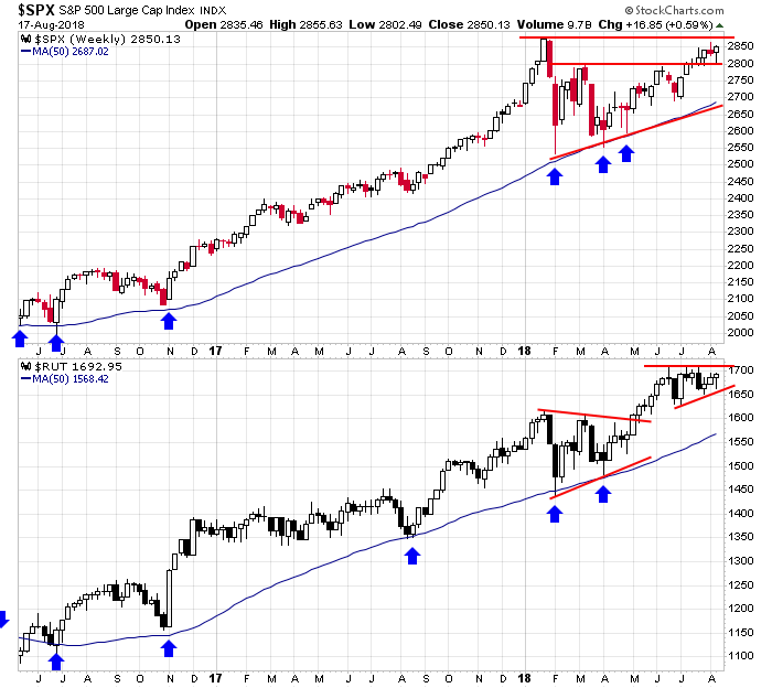
The S&P 500 & Russell 2000 Weeklies: Another week in the books. Both the S&P 500 and Russell 2000 tested lower and then closed up on the week and at their intraweek highs. The S&P is consolidating between a former resistance level (2800) and the all-time high. The Russell continues to tighten up between converging trendlines near its all-time high. On the weekly time frames, both these charts look fantastic.
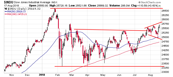
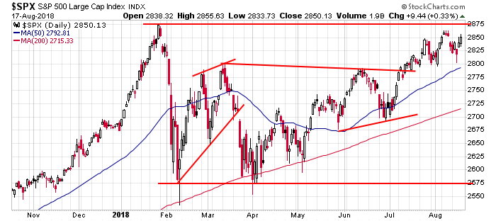
The Dow and S&P 500 Dailies: The S&P daily has been very gappy lately, but with higher highs and higher lows in place and a rising 50-day MA, the index is stronger than neutral. The Dow, which has been the weakest index, put in a lower low and then a higher high. I don’t know if money is going to rotate out of non-Dow stocks into Dow stocks or if strength here will finally unleash the entire market. In either case a rising Dow isn’t a bad thing.
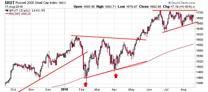
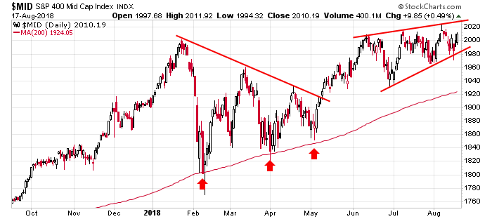
Russell 2000 and S&P 400 Dailies: The Russell 2000 daily remains a beautiful chart – the index is getting squeezed by converging trendines at an all-time high. The first target is around 1820. The S&P mid caps look great too. It traded below the lower trendline of the rising wedge drawn but quickly recovered. The trend is certainly up.
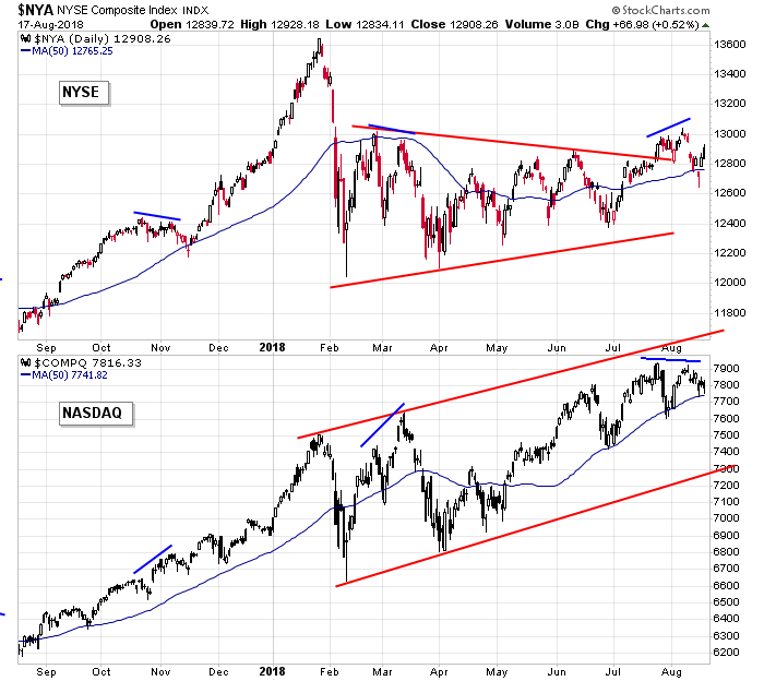
NYSE and Nasdaq Dailies: Both the NYSE and Nasdaq are above their up-trending 50-day MAs, so you could conclude both are trending up. But they haven’t moved in sync the last month, and overall, the market does best when they’re on the same page. It’d be nice if these two tightened up.
Indicators
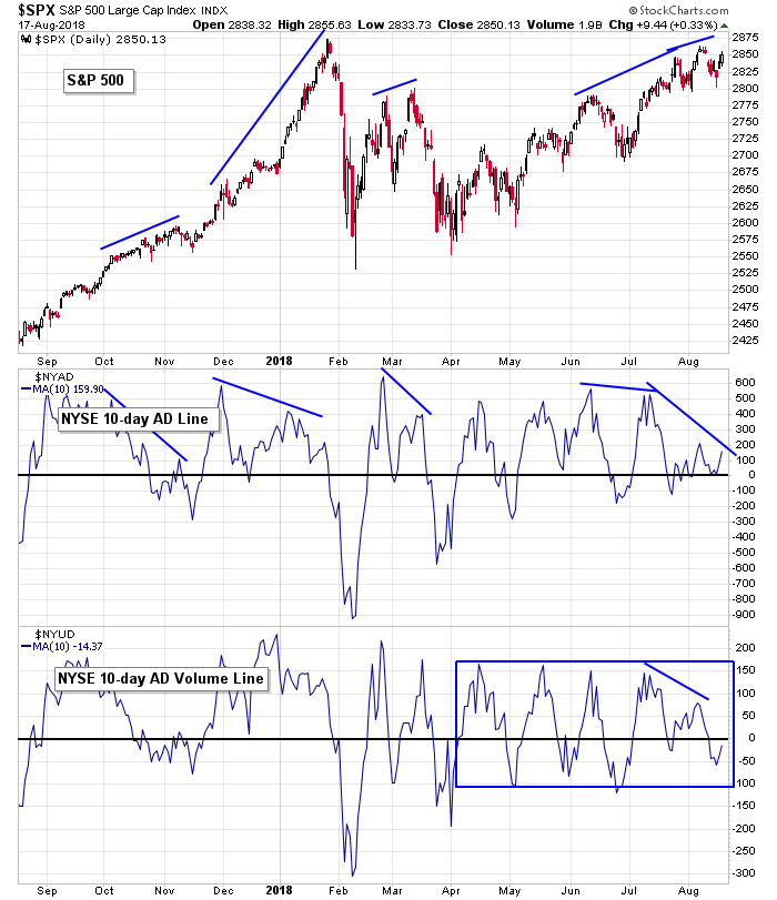
S&P 500 vs. 10-day MA of NYSE AD Line & 10-day MA of NYSE AD Volume Line: The 10-day of the AD line has hovered just above 0 the last couple weeks – a sign buyers and sellers are almost in balance. The 10-day of the AD volume line has had slightly bigger swings above and below 0 and right now happens to be below – the net of the last couple weeks is near 0, so this too suggests a nearly equal battle. Any rally early next week that attempts to take out the high will need to be accompanied by higher highs from both these indicators. Otherwise another negative divergence will be in place, and prices will come down again.
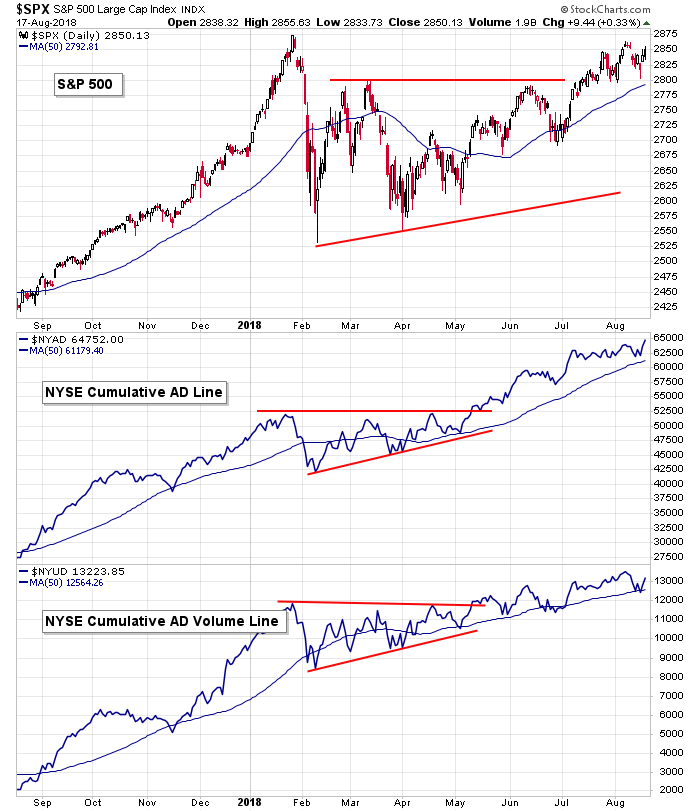
S&P 500 vs. NYSE Cumulative AD Line & NYSE Cumulative AD Volume Line: The cumulative version of the AD and AD volume charts are in great shape overall. Both have hit higher highs this month and are trending up. Per these charts, there are no indications the long term trend is going to reverse soon. The market isn’t likely to fall hard until these charts roll over.
S&P 500 vs. NYSE New Highs & NYSE New Lows: New highs are still not high enough to support a sustained rally, although they did close Friday at nearly a 1-month high. New lows spiked up this past week, which is something you’d expect after a 5-10 day drop, not after a measly 4-day pullback. Both set the stage for higher prices next week. New lows hinted at short term capitulation…new highs are one day from hitting a 2-month high. The stage is set.
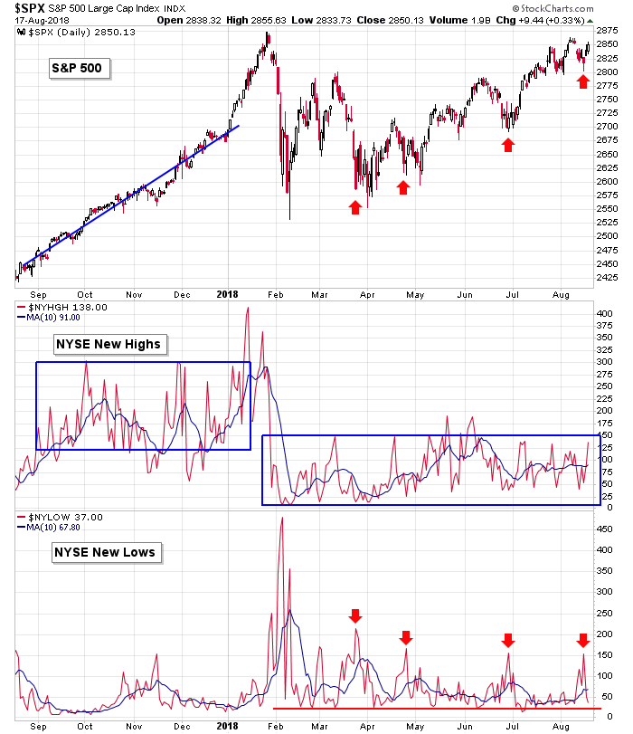
S&P 500 vs. NYSE New Highs – New Lows: The high-low differential at the NYSE matched its June low and then spiked. Not bad. We need sustained prints above 0 – like the end of last year and January – to support a full-blown rally, but at least there is no evidence a big drop is in the works.
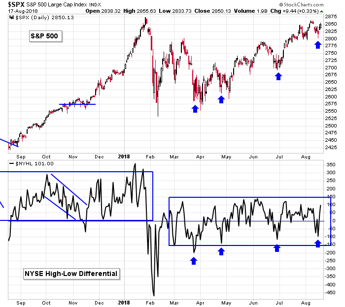
S&P 500 vs. Cumulative NYSE New Highs – New Lows: Here’s a different look at the high-low differential. Trending down (red box) warns of underlying weakness. You can see what happened. Trending up (middle of chart) implies sunny skies above, and the market response favorably. Flat movement (blue box) suggests a lack of conviction by both the bear and bulls – neither new highs nor new lows are high enough to strongly shift the balance of power one way or the other. If the market is going to trend up, the blue box will need to resolve up, and the indicator will need to start resembling the middle of the chart.
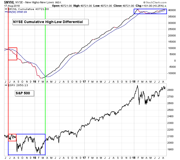
Nasdaq vs. 10-day MA of Nas AD Line & 10-day MA of Nas AD Volume Line: The Nas AD and AD lines are moving virtually the same as their NYSE peers. The recent action suggests advancers and decliners and advancing volume and declining volume are nearly equal, which matches the movement of the indexes. No strong hint is offered headed into next week.
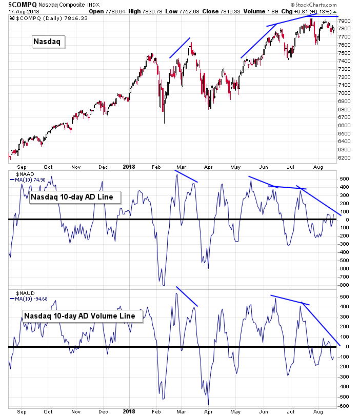
Nasdaq vs. Nas Cumulative AD Line & Nas Cumulative AD Volume Line: Both the cumulative AD and cumulative AD volume lines are slanting down within an overall uptrend. Given the numerous penetrations below the 50 – even during the strong move last fall and early winter – I’m not concerned yet. When they actually sustain a downtrend, I’ll question the market’s ability to move up. Until them I’ll continue to believe dips will be bought.
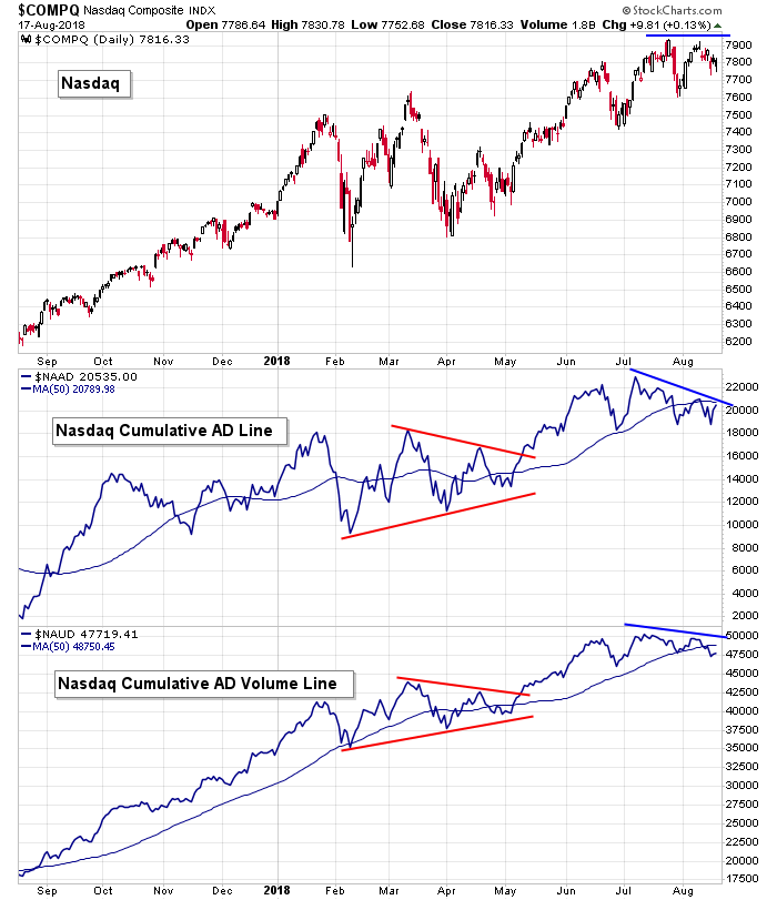
NASDAQ vs. NASDAQ New Highs & NASDAQ New Lows: New highs at the Nas remain in the dumps – definitely not supportive of a rally attempt. New lows spiked last week to their highest level since early-February – an odd sign of capitulation given the Nas barely moved off its high. This tells me that despite the market generally moving up many stocks have been quietly moving down…and all it took was a mini sell-off to cause these stocks to drop to 52-week lows. It is curious the Nas can be so close to its all-time high, yet new lows can spike.

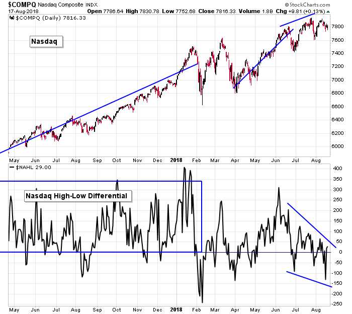
NASDAQ vs. NASDAQ New Highs – New Lows: The high-low at the Nas has been trending down for two months while the Nas has trended up. This is not how the indicator should act while the market is doing well. Better confirmation is needed.
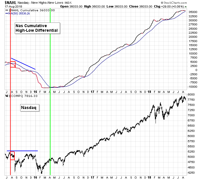
NASDAQ vs. Cumulative NASDAQ New Highs – New Lows: The cumulative high-low differential at the Nas is coming into its 50. This is not a magical moving average, just a guide. We’re told this is a little soft spot, but given a trend down lasting a several weeks is needed to signal any real problems, the bulls shouldn’t be concerned.
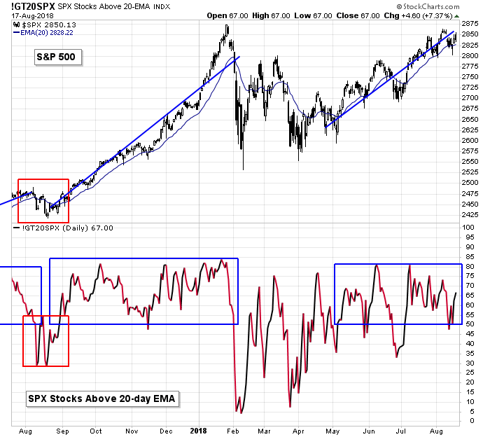
S&P 500 vs. Percentage of SPX Stocks Above 20-day MA: The percentage of SPX stocks above their 20-day EMAs dropped to the bottom of the range that characterizes a healthy market and bounced. This supports the current trend.
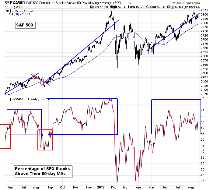
S&P 500 vs. Percentage of SPX Stocks Above 50-day MA: Two ways to look at this chart. The percentage of SPX stocks above their 50-day MAs has remained above 55%, a key level that seems to divide healthy and unhealthy markets. But there have been no high prints. Unlike last year’s end-of-year rally where many prints above 70% were registered, today those are rare. The bulls are in control, but it’s not strong control. No surprise given new highs haven’t moved up either.
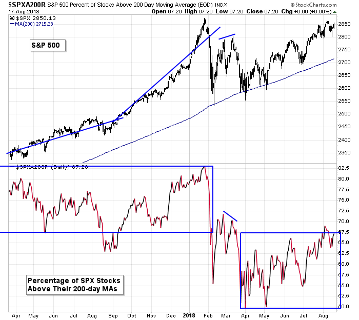
S&P 500 vs. Percentage of SPX Stocks Above 200-day MA: The percentage of SPX stocks above their 200-day MAs has been steadily improving since early May but is still nowhere near where they should be given the S&P’s proximity to its high.
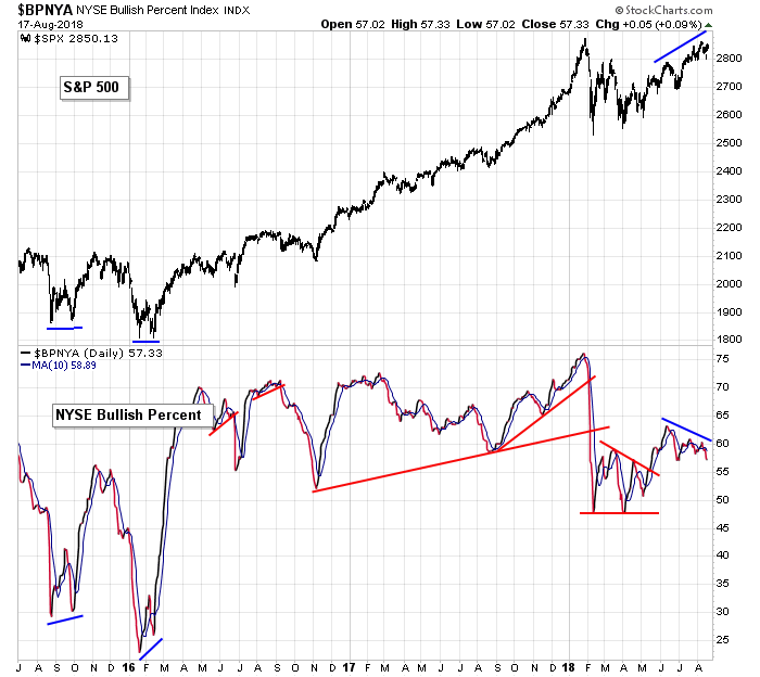
S&P 500 vs. NYSE Bullish Percent: The bullish percent at the NYSE is trending down near the bottom if its “healthy” range, which I’d define as 60%. It’s not in horrible shape, but it does need to reverse and trend up if a rally is to sustain itself.
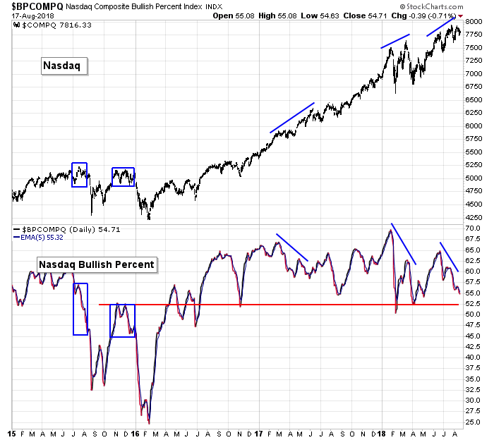
NASDAQ vs. NASDAQ Bullish Percent: The bullish percent at the Nas is also trending down but is not at a horrible absolute level. Improvement is needed if anything but a short-lived bounce is going to materialize.
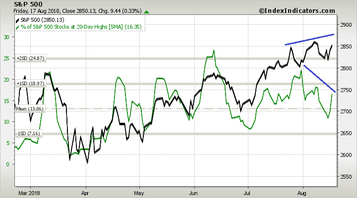
S&P 500 vs. Percentage of SPX Stocks at a 20-day High: The S&P is moving up while the percentage of SPX stocks hitting a 20-day high is moving down. This needs to be negated for any rally attempt to hold.
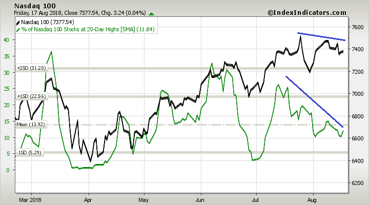
NASDAQ 100 vs. Percentage of Nasdaq 100 Stocks at a 20-day High: The percentage of NDX stocks at a 20-day high has been trending down for a month while the NDX itself has been flat. This too needs to be reversed. The two curves moved in pretty good lock-step until mid-July. They need to get back in line.
The Bottom Line
Two weeks ago the market’s breadth softened, and the indexes have been shaky ever since.
The indicators are now mixed – some have improved and would support a rally attempt; others are still in the bears’ camp.
I can see a rally attempt materializing early next week. And if the market’s breadth improves, the market could take off. But if they don’t improve, it’ll be just another pop that gets sold into.
The long term trend remains solidly up. Shorter term I see some improvement. Next week will be interesting.
Have a great week.
Jason Leavitt
2 thoughts on “LB Weekly (Aug 19)”
Leave a Reply
You must be logged in to post a comment.
Thanks for sharing this week.
When trading trends get sloppy as they recently, the set-ups still occur but normal Stop procedures let initial profits get away.
A stable trend doesn’t present that problem.
How to still take the good set-ups but not get whip-sawed?
Enter normally, say a daily entry trigger confirmed by supportive weekly trends.
When the general market is muddy, shorten your charting time frame to manage potential exits.
Enter using daily, but manage using hourly, or my favorite 65 minute. You can then use the same Stop techniques, maintain your discipline, and logical consistency, but avoid the whip-saws except in the case of a contrary big Gap open contrary to your trade. That can, and does happen on all time frames.