Moving Average Convergence/Divergence, or MACD, is a momentum indicator that compares the difference between two moving averages with a third moving average. Signals are offered via signal line crosses, centerline crosses, divergences and a couple other patterns discussed below.
—————
FREE Online Course: Jason Leavitt’s Mini Masterclass in Trading
—————
The indicator is calculated by first taking the difference between two moving averages. When the shorter term MA is above the longer term MA, the MACD will be above 0, and when the shorter term MA is distancing itself from the longer term MA, the MACD will be moving up. The opposite is also true. When the shorter term MA is below the longer term MA, the MACD will be below 0, and when the shorter term MA is distancing itself from the longer term MA, the MACD will be moving down. So the MACD does what its name implies; it charts whether two moving averages are coming together or moving apart, thus suggesting an increase or decrease in momentum.
When the shorter term MA crosses the longer term MA the MACD crosses 0, and a signal is given.
A third moving average is often used as a signal line too. When the MACD described above crosses this third MA, a signal is given.
Divergences exist with the MACD, but because the indicator is unbound, meaning there is no forced high and low, the concept of overbought and oversold don’t have much meaning, so divergences have less meaning too.
The values (12, 26, 9) tend to be the default in most charting platforms, meaning the 12-period moving average is the short term MA, the 26-period moving average is the long term MA, and the 9-period moving average is the signal line. These parameters can be changed to speed up or slow down the signals and can be applied to long term charts as well as intraday charts.
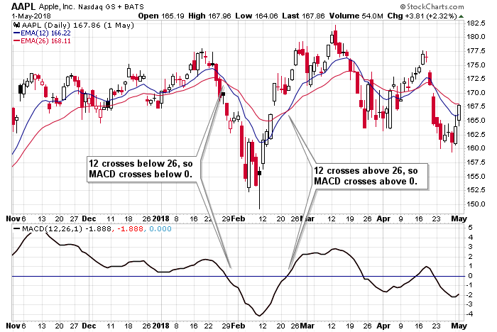
This AAPL chart highlights the 12 crossing below the 26 in January (MACD crosses below 0) and the 12 crossing above the 26 in February (MACD crosses above 0).
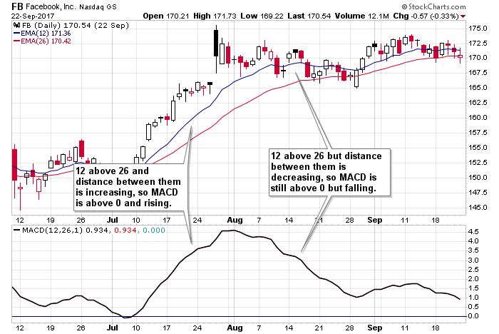
In July of this FB chart, the 12 was distancing itself from its 26, so the MACD line was rising. Then in August, the two moving averages were converging, so the MACD was dropping.
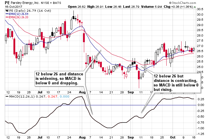
PE fell hard in August on this chart. The 12 was below the 26, and the distance between them was increasing, so the MACD was below 0 and dropping. Then while the 12 was still below the 26, the distance between then was decreasing, so the MACD was still below 0 but rising.
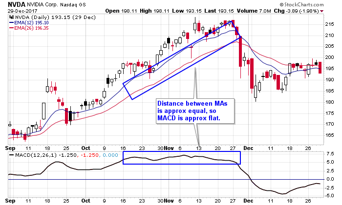
And finally, this NVDA chart shows when the two moving averages stay approximately equal distance apart, the MACD flattens out.
Signal Line Crossovers
The signal line is the third moving average described at the top. When the MACD (the difference between the short and long moving averages) crosses the signal line – up or down – a signal is given. This is the most popular way to use the MACD, but it shouldn’t be used carelessly.
It’s best used in a wide ranging market where stocks are rolling up and down; signals are helpful identifying changes in direction. But in a trending market, a simple rest or innocent sideways period will lead to a signal line cross that is misleading. While this offers a slight warning and perhaps a reason to take partial profits, entering an opposing position in anticipation of a reversal is not wise. False signals are common with trending stocks.
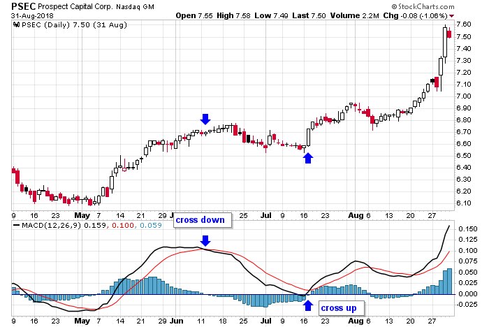
PSEC’s strong May/June rally ended with a cross down of the signal line. Then the uptrend resumed with a cross up of the signal line in mid-July. This is typical. Within an uptrend, the cross down marks the beginning of a resting period, and then the subsequent cross up marks the beginning of the next rally.
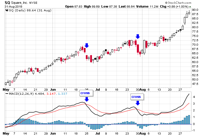
This SQ charts shows how signal line crosses that occur within trends are often short-lived. The stock was strongly trending up when a cross took place in June, but because the trend was so strong, the stock didn’t fall far or for long before righting itself and resuming its trend. A similar cross took place in July with the same result.
Centerline Crossovers
A centerline cross ignores the third moving average and occurs when the shorter term MA moves above or below the longer term MA. So when the 12-period MA moves above the 26-period, the MACD will cross above 0, and when the 12 moves below the 26, the MACD will cross below 0. This is all done while paying no attention to the 9 MA. Essentially this application of the indicator allows the MACD to repeatedly cross above and below the signal line, but it’ll maintain its signal as long as the shorter term MA does not cross the longer term MA. Because of this, the indicator is slower and allows trends to rest and reassert whereas signal line crossovers flash many false signals while the market trends.
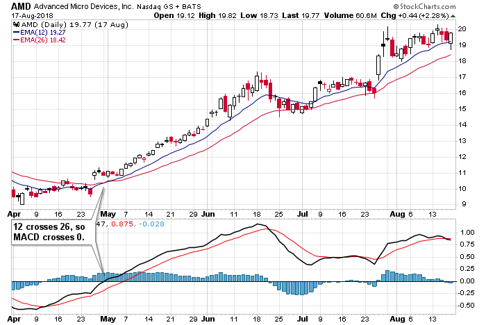
In this AMD chart, the 12 crosses above the 26 in late April. But despite the MACD crossing its signal line in mid-June and again in late-August, the 12 (blue) stayed above the 26 (red), so the MACD never dropped below 0. For those who play the bigger picture trends, it would be acceptable to stay in a long position under these circumstances. Often a signal line cross is nothing more than a temporary correction within a bigger trend.
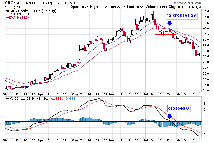
CRC dropped off a high in early July and then rested long enough for the 12 to cross below the 26. This is shown in the MACD pane via the black line crossing below 0. After taking out a support level, the 12 separated from the 26 and momentum built.
Divergences
Divergences form when the underlying stock moves to an extreme – a higher high or lower low – but the MACD fails to confirm the move. It doesn’t tell us the trend is changing, but it does tell us momentum is declining. So if a stock moves to a higher high while the MACD puts in a lower high, the trend and momentum may still be up, but they aren’t as strong as on the previous rally. And if a stock prints a lower low but the MACD puts in a higher low, it can be said the downside momentum is waning.
One point of warning before some examples are shown – be careful playing divergences within trends. Often a trend will start with a big thrust in momentum that can’t be matched at a later date. The underlying can still trend up for a long time even though the MACD never approaches its previous high. As with signal line crossovers discussed above, there can be many false signals within a strong trend. It’s best to use divergences with wide-ranging, rolling stocks.
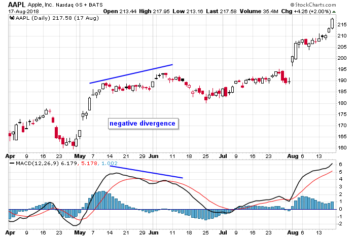
In the Apple chart below, the early-May surge pushed the MACD well above 0, and the distance between the two sets of moving averages was widening. But after a rest, the higher high in early-June came with much less energy, so the MACD could not match its previous high. This formed a negative divergence and led to a short-term pullback.
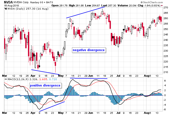
NVDA is a choppy stock that can be tough to trade, but a couple divergences hinted at reversals. The stock dropped to a lower low in April while the MACD put in a higher low. It was still under 0, but the downside momentum was waning, telling us the downside was limited. Then, in May and June it put in a negative divergence, which told us the upside momentum was dying, and at the very least, the stock was likely to stall.
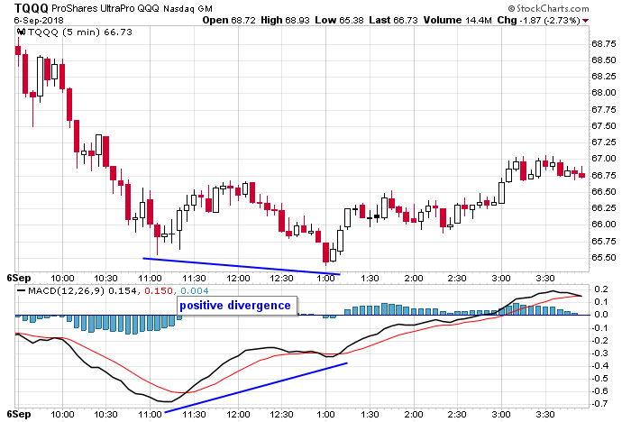
This is a 5-min chart of TQQQ, the leveraged QQQ ETF. The stock was weak during the morning session, but after a positive divergence formed, the stock reversed up. Maybe the stock rallies back to its intraday high; maybe it fizzles. You never know what will happen, but you can read the signals, and in this case, either take profits on a short or nudge a stop very close.
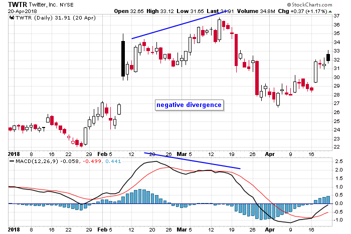
Twitter, which has previously been trending up, jumped the second week of February. This produced a relatively high MACD value. The subsequent rally in March couldn’t gather the same momentum, so a lower MACD reading was recorded. The negative divergence led to a tradable correction that eventually got bought up again.
Kiss
A kiss signal is a continuation signal within a trend. It tells traders the trend, which has stalled, is reasserting itself. It entails the MACD crossing its signal line, and then after trending, it’ll come back and “kiss” the signal line and continue in the same direction. For those who like playing dips within uptrends, this is a great indicator.
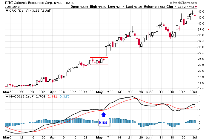
CRC crossed its signal line in March. After rallying steadily for about 7 weeks, the stock stalled just long enough for the MACD to kiss its signal line and then reassert to the upside. That 2-week resting period at the end of April and beginning of May was nothing more than a pause within a trend.
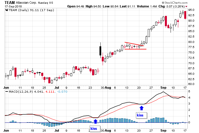
TEAM crossed up in early July. A pause in mid-July and another in mid-August coincided with MACD kisses that told us the trend was reasserting. The first one was not playable because of the big gap, but the second certainly was.
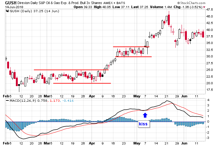
GUSH crossed its signal line in February. After the stock moved sideways and then up it entered a 3-week consolidation period in late April/early May. The MACD came down and kissed its signal line and then reasserted itself. This was the end of the consolidation. The next leg up of the uptrend began soon after.
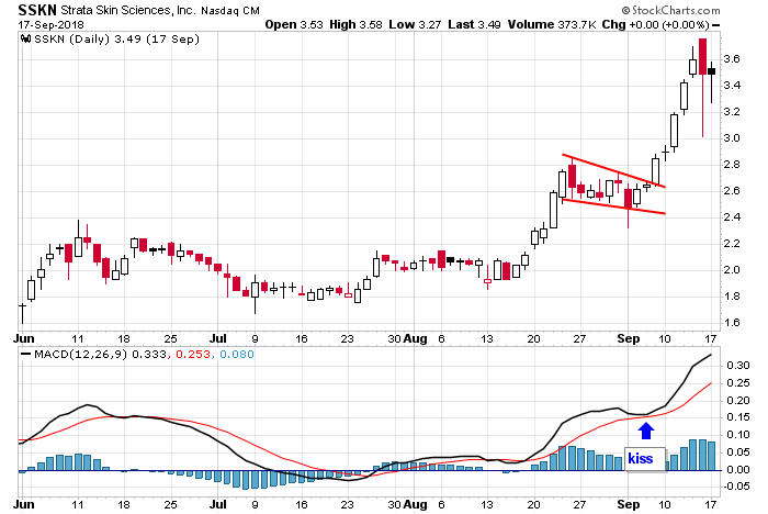
SSKN based for 10 weeks between early June and mid-August. It then trended up, paused and reasserted. During this time, the MACD assisted in letting us know when the stock would continue up by coming down and kissing its signal line as show.
A-B-C
An A-B-C pattern is an up-down-up or down-up-down formation that coincides with a stock moving directionally, stalling or correcting, and then moving directionally again. The MACD itself will move with force in one direction, reverse (while ideally staying on the same side of the 0 line) and then move again. It’s similar to the kiss pattern, but instead of a simple “touch-and-go,” there two signal crosses.
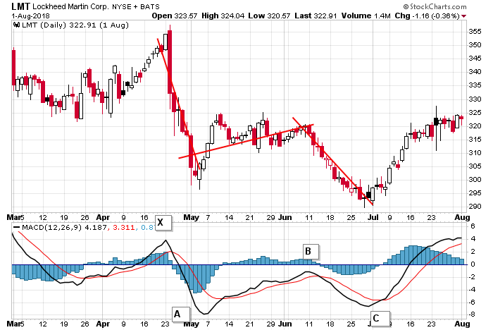
LMT dropped hard in late April, recovered some in May and early June and then legged down again in June. The first drop is A; the recovery is B; and then the reassertion of the trend is C. Notice the A-B leg stayed below 0, telling us the bounce was just a bounce within a downtrend, not the beginning of an uptrend.
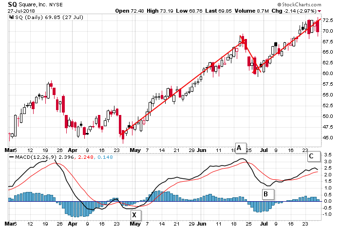
This SQ chart shows how the A-B-C pattern can be used to trade a dip within an uptrend. The stock trended up with force in May and June and then pulled back before resuming its trend. The A-B leg stayed above the 0 line and assisted in identifying the end of the pullback and beginning of the next leg up.
Combinations
Some traders will combine the techniques described above to get a fuller and more meaningful picture. This may entail recognizing a divergence followed by a trendline break which is then followed by a crossover. Here are a few examples.
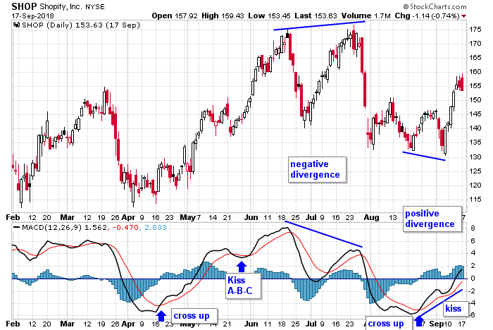
SHOP rolled up and down for several months and therefore was a good candidate to use various MACD techniques to identify reversals and continuations. There was a cross up in April and then a kiss or mini A-B-C near the end of May, which signaled a resumption of the trend. The negative divergence that formed in June and July told us the stock wasn’t going to build much on the July high. A cross up in mid-August was followed by a positive divergence and kiss in September. Nice free flowing chart with lots of assistance from the MACD.
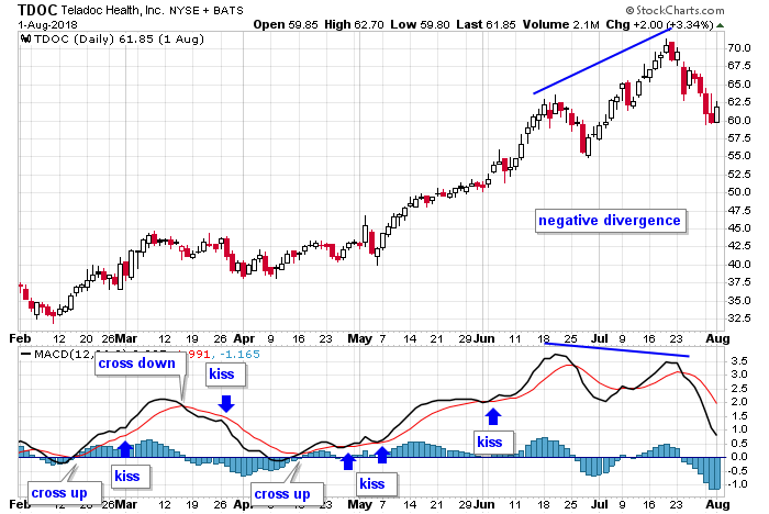
TDOC crossed up in February and then did a mini kiss in early March. A cross down and kiss followed later in March. A cross up in mid-April started a trend that was assisted by 3 kisses before a negative divergence formed in June and July.
This write-up is a work in progress. More examples will be posted. Join our email list. Be alerted of new content.