There’s an on-going debate about the current market – is a top forming, or has what’s taken place the last 18 months (give or take) just a big consolidation period within an uptrend?
Entering such a debate is silly at best and dangerous at worst. Silly, because it doesn’t matter unless you’re managing billions of dollars and need time to exit positions. Most on Wall Street would be wise to turn their brains off and just go with the flow. Dangerous, because it causes you to dig in and defend a position instead of being open minded.
—————
Not a Leavitt Brothers subscriber but appreciate our work? Consider making a small donation.
—————
More money is lost (in terms of lost opportunity because investors are not fully invested) trying to pick or guess tops than during corrections. There’s a reason why passive 401K accounts often out-perform hedge funds.
Nevertheless, as an intellectual curiosity, let’s review the last three tops (or potential tops) and compare them to the current market structure.
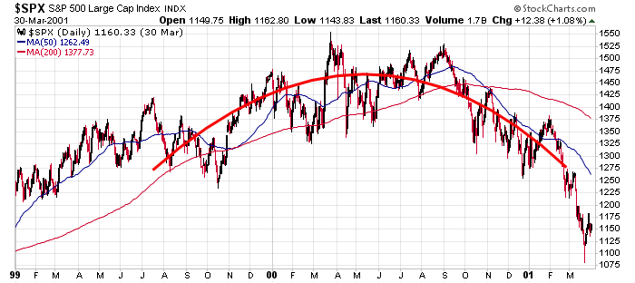
In 1999, 2000 and 2001, the S&P 500 chopped it way to a new high in March 2000 and then moved sideways into the fall before a downtrend started in ernest.
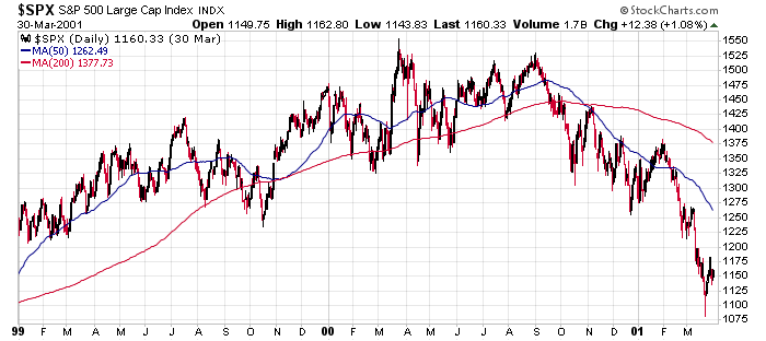
But if you look closer, the topping action has a rounded shape to it. It’s not perfect, but it’s pretty darn close.
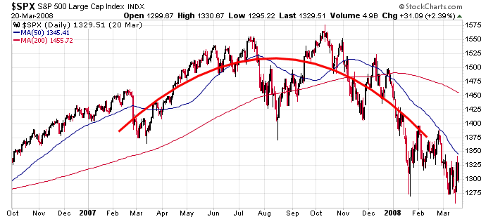
In 2007 and 2008, the S&P 500 also chopped its way up to a new high (October 2007) and then trended lower, getting rejected twice by the 50-day MA in December.
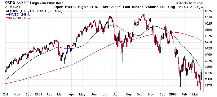
Looking closer, the action also had a rounded shape to it. The market rallied up and then moved down. There was no hysterical squeeze that produced a spike high, and the move down on the other side was orderly and normal.
In 2014, 2015 and 2016, the S&P 500 was kind of/sort of forming rounded top, but it certainly wasn’t as smooth and clean as the previous two. The big plunge down in August 2015 and subsequent rally in October didn’t appear during the unraveling of the Dot Com bubble or Financial Crisis. Then there was another big plunge in January 2016.
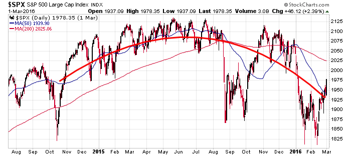
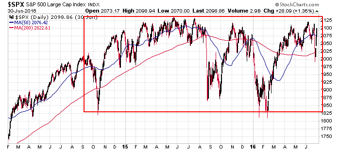
Then the rally in the first half of 2016 negated any semblance of a rounded top and gave the entire chart the structure of a rectangle, with lows and highs that matched up going back two years. In hindsight, we know this chart resolved up, so it wasn’t a top; it was a 2-year consolidation pattern within an uptrend.
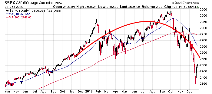
As of the end of last year, the S&P had the look of a rounded top, although the December plunge was reminiscent of the two plunges that took place within the 2015 and 2016 consolidation period. Rounded tops have price action on both sides of a rounded arc, and there are no big moves in either direction.
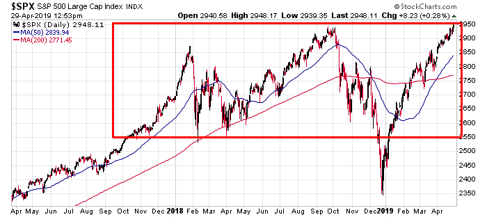
And now the updated chart. With the current rally matching the previous high, the structure of the chart (a big rectangle) more closely resembles the 2015/16 consolidation pattern that resolved up, not the Dot Com or Financial Crisis tops.
You could argue this analysis is amateurish, that simply comparing the structure of the price action and saying the current chart looks more like X than Y and therefore means the market is going up, lacks effort, but I’d disagree.
The structure of a chart tells a story. It tells us what Wall Street is thinking and feeling and doing. Should we be surprised the two 50% corrections in the last 20 years both started off in unassuming fashion, with price simply moving down, as if nothing was wrong? And that the other potential top, which had two scary plunges where everyone assumed the worst and ended up jumping ship at the same time, ended up just be a wide consolidation pattern that would set the stage for a massive rally?
It actually makes total sense. In all three cases, Wall Street was wrong. They were very worried in 2015 and 2016 but weren’t very worried in 2000 and 2007.
Structurally, tops tend to be rounded, not flat. The market doesn’t ramp up and then linger; it ramps up and then drops and then lingers at a lower level. A flat top, which is what I’d consider the current situation because the S&P is at its all-time high, matching the high from September, would be rare.
I think it’s perfectly legit to say today’s chart resembles 2015 and 2016 and therefore we should be positioned to profit from a move up and not assume a top is forming.
One thought on “Q2 2019 – This is Not What Tops Look Like”
Leave a Reply
You must be logged in to post a comment.
Yield curve is still not flat or inverted. I say stay long or be wrong