2020 has gotten off to a solid start.
In its first full week of trading, the S&P 500 posted a gain 3/5 days and hit a new all-time high three consecutive days to end the week. Mega caps continued to lead – Apple, Microsoft, Google and Facebook all closed at new highs. And this week software names joined – ZM, OKTA, RNG, TWLO, ZEN, AYX, AVLR, COUP and many others did great.
Quant studies are starting to point to 2020 being a good year. Since 1950, when the first 5 days of the year are positive, the market has posted a gain 36/45 times (80%), with an average/median gain of 13.6%/13.6%. This is only slightly better than “all years,” so don’t get too excited. But when the S&P gains more than 0.65% in the first five days, as it did this year, the index posts a full year gain 31/35 times (89%), with an average/median gain of 17.2%/20.9%. Much more encouraging.
These types of stats don’t guarantee anything, but they do provide a solid backdrop. I believe the biggest loss in the market is cash sitting on the sideline. Negative headlines produce enough doubt to keep traders and investors under-exposed, and when the market runs up like it has the last three months, gains are made, but they’re much smaller than they should have been. A key to trading is to fully take advantage of opportunities. If knowing that over the last 70 years when the market was up 0.65% the first five days of January produced a 89% win rate for the year, perhaps traders and investors wouldn’t be under-invested. Anything can happen in any given year, and we of course don’t know what the path the market will travel, but if you can stomach an occasional down year, the up years will more than make up the difference.
We enter 2020 with the trend being up, leaders leading, and very supportive internals. This by itself keeps us in the bulls’ camp, only interested in the long side. Add that this is an election year – a traditionally positive year – and historical studies are starting to hint at further gains, we have no choice but to be optimistic looking forward.
Again, we don’t know what path the market will travel. And it’s entirely possible this is one of the 11% of the years that doesn’t do well after posting a 0.65% gain. But if you want to make money, you have to take a risk. You have to do something. The “wall of worry” operates to keep people on the sidelines. That’s its job. That’s its role. It keeps people at bay, so acute traders like us can establish positions within trends. And when FOMO (fear of missing out) kicks in, and that sideline money is put to work, our positions get juiced.
You can be long, short or on the sidelines…and of course there’s some gray area. I choose to be long. Individual trades must be managed wisely because any stock can do anything while the market steadily trends up. But being long is the way to go. Be willing to take a risk to expose yourself to the upside while managing the downside. Nothing works all the time, but if operate like this and are willing to accept a few losses, you’ll do great over time.
Again, negative news operates to keep traders and investors on the sidelines. That’s its role. Recognize the deception and don’t let it affect you. The charts are your best source of reliable information. I trust them more than I trust anything else.
Let’s get to charts and see if there are any changes.
Indexes
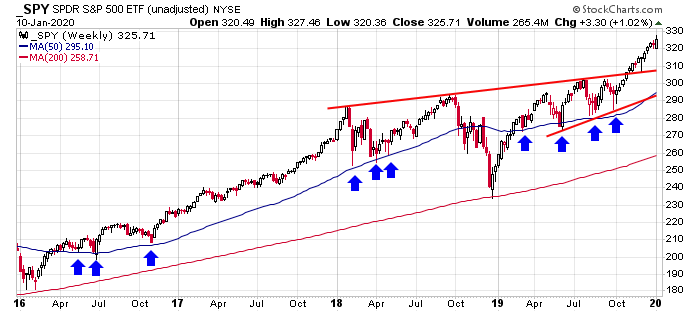
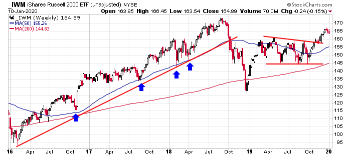
The S&P 500 & Russell 2000 Weeklies (via SPY & IWM): The S&P posted a solid gain for the week. The Russell, due to selling Thursday and Friday, closed down slightly and in the middle of its weekly range. These two charts would suggest the large caps are doing much better than the small caps, but this isn’t the entire story. Measured of the Dec 2018 bottom, the S&P is up 38% while the Russell is up 30%. That’s not a huge difference. The reason the S&P is well into new high territory and the Russell still hasn’t taken out its 2018 high is because the Russell fell so much more in Q4 2018. Without that the Russell would also be at an all-time high. Perhaps I’m, searching too hard. This is just my way of saying the situation isn’t as drastic as it seems. But I’d still like the see some improvement from the small caps. I’d like to see them lead some. Under performing is not a good backdrop.
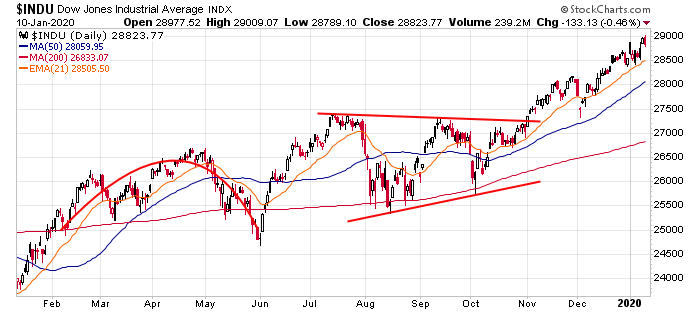
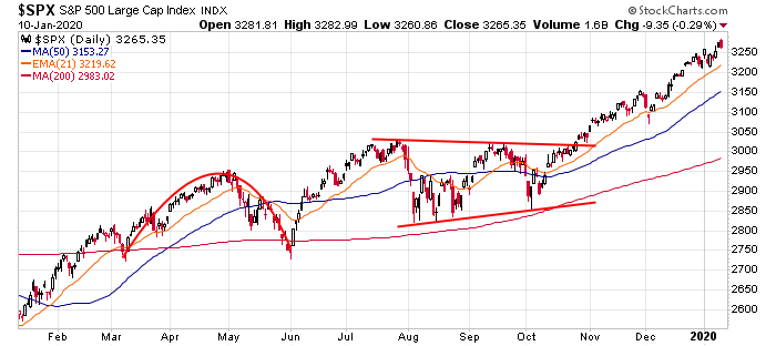
The Dow and S&P 500 Dailies: What can be said? Another week – another all-time high for the Dow and S&P 500. Those waiting for a dip have been utterly frustrated. The 50- and 200-day MA’s are “way down there” – maybe too far down there.
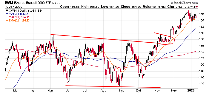
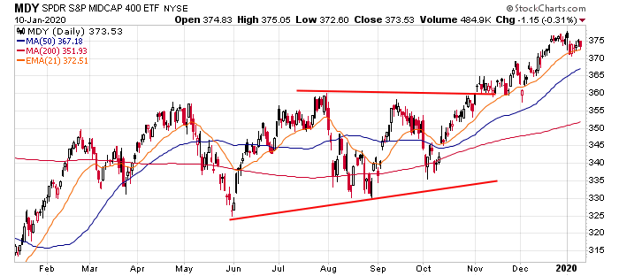
Russell 2000 and S&P 400 Dailies (via IWM & MDY): The Russell 2000 and S&P 400 have slanted down since the beginning of the year. In both cases, considering the moves off the October lows, this is not a concern. The market chops more than it trends, so it deserves to do nothing for a while. But relative to the large caps, the inability to “keep up” is notable.
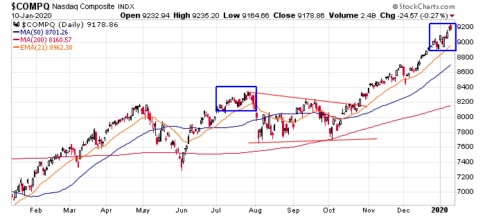
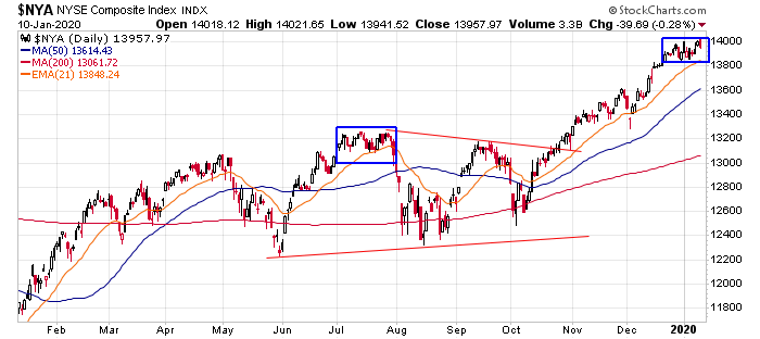
Nasdaq and NYSE: The market does best when the NYSE and Nasdaq are on the same page. They’ve moved together for 3 months but are now starting to move apart. The Nas easily moved to a new high last week; the NYSE did technically did too, but not to the same degree. This is reminiscent of last July (see blue rectangles), right before a quick 5-day plunge.
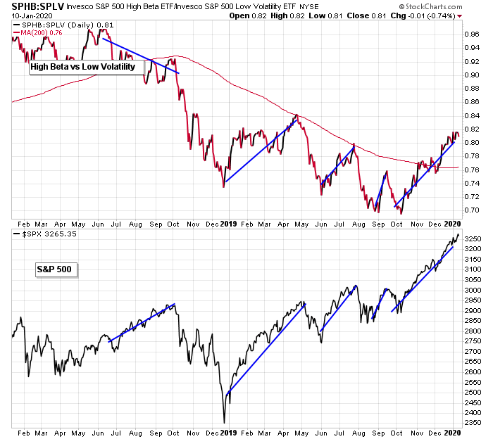
High Beta vs. Low Volatility: High beta stocks are leading the market higher while low volatility names peter along. This keeps the relative strength line trending up. A top can come at any time – there doesn’t have to be a warning – but unless there’s a divergence, I’d expect any dip to get bought.
Indicators
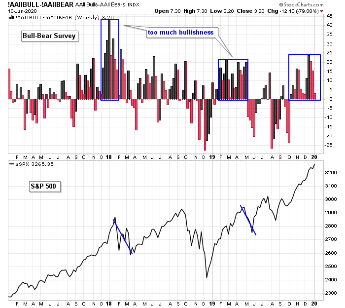
AAII Bulls – AAII Bears: Another positive reading for the bull-bear survey. In a backwards way, this isn’t the best backdrop for a continuation of the rally. Too much bullishness – like what existed in Dec 2017 and Jan 2018 and then again Feb-Apr 2019 – were followed by stiff drops. But 2017, which saw the market steadily move up, had sporadic bull-bear prints on both sides on the zero line. Too much bullishness is not good. Some doubt and worry and naysaying is good for the market’s trend.
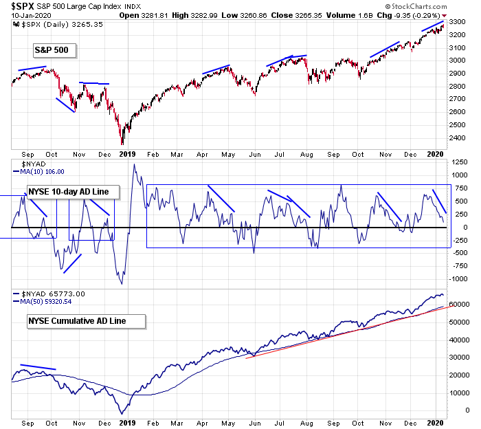
S&P 500 vs. NYSE AD Line (10-day & Cumulative): The cumulative NYSE AD line fully supports the market’s overall trend, but the 10-day is rotating down. Long term the market is in great shape and has a huge cushion to work with but short term weakness is seeping in. This doesn’t mean the market has to correct hard, just that a dip is on the horizon absent the indicator rotating back up soon.
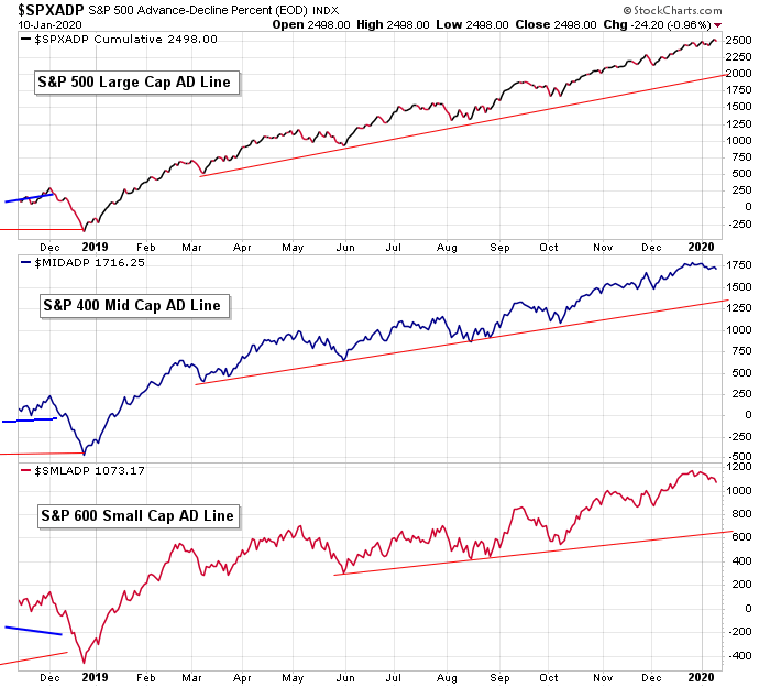
AD Lines by Large Cap, Mid Cap and Small Cap: There are no warnings from the AD lines of each market cap. Yes the large caps are dominating, but the small caps are pulling their weight. If the small cap line was down further and forming an obvious negative divergence, it would be a near-term warning. Things can change (the small caps line is starting to roll over), but given the across-the-board strength, underlying strength exists.
Nasdaq vs. Nas AD Volume Line (10-day & Cumulative): Thanks to many high-volume Nas stocks posting big gains the last 3 months, the AD volume line at the Nas has accelerated upward. The 10-day is off its high and starting to form a negative divergence. Longer term strength. Near term is slightly weakening.
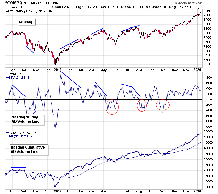
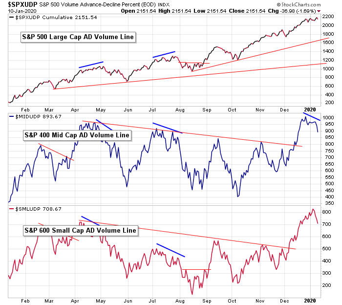
AD Volume Lines by Large Cap, Mid Cap and Small Cap: The large cap AD volume obviously controls the AD volume line posted above – it displays the same increased slope. The mid cap and small cap lines recently hit new highs but are now turning over. Was this a last gasp (everything is on board) or long-waiting confirmation? We’ll see. All the lines have a cushion to work with, but simply falling back into range would be enough to induced some selling.
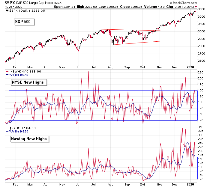
S&P 500 vs. NYSE and Nasdaq New Highs: New highs at both the NYSE and Nas tell us participation is broad-based. The prints are off the highs but still at solid levels.
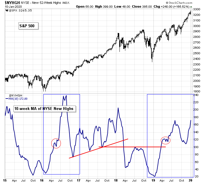
S&P 500 vs. NYSE New Highs (weekly): New highs at the NYSE on the weekly time frame are acting very well. Absent a crash and failure to recover, any market pullback should get bought.
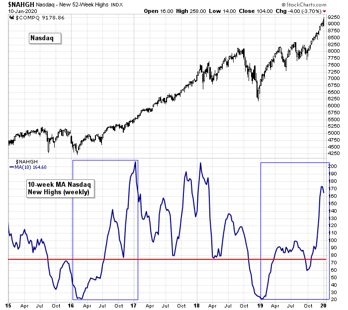
Nasdaq vs. Nasdaq New Highs (weekly): New highs at the Nas on the weekly time frame are doing even better. I’ll repeat what I’ve noted a few times the last month: This indicator is looking very similar to 2016, just prior to the big 2017 rally.
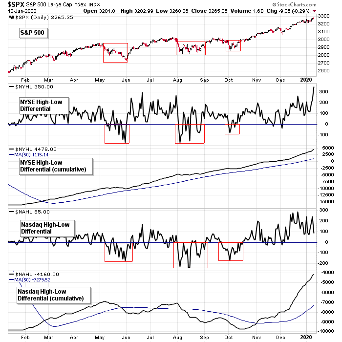
S&P 500 vs. NYSE and Nasdaq High-Low Differential: The 52-week high-low at the NYSE has spiked up to its highest level since January 2018, which incidentally was a top. The Nas has been hanging out at a high level for 3 weeks. The cumulative lines of both are trending up, well above their 50’s. The market is well supported, so any weakness should get bought.
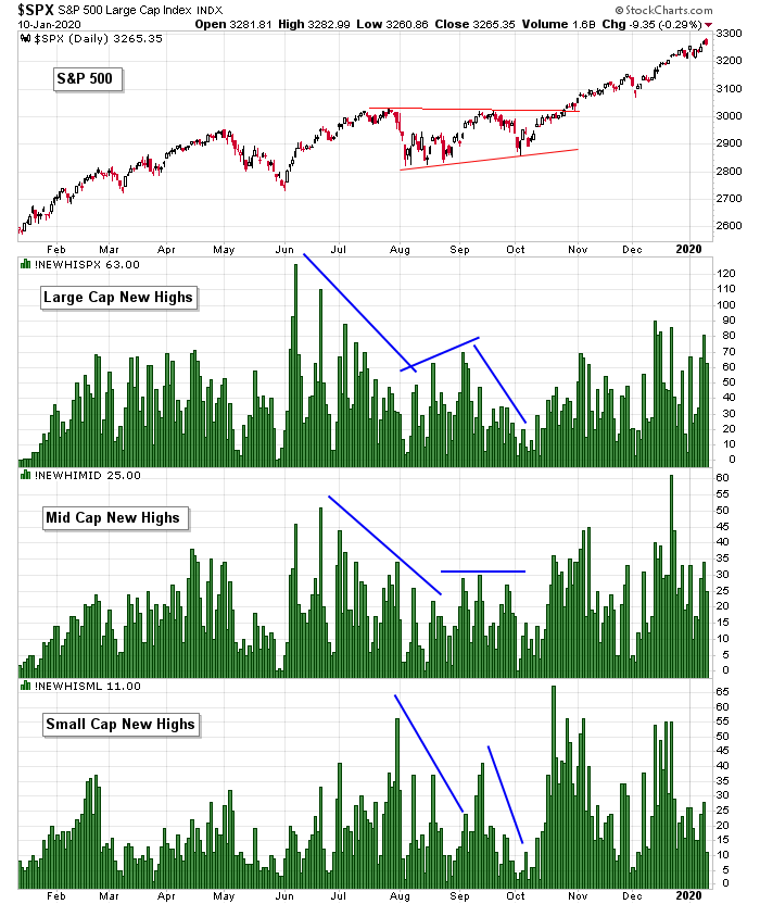
S&P 500 vs. New Highs of Large, Medium and Small Caps: New highs among large caps and mid caps are registering at decent levels. Among the small caps, the print is down but still solid. There are no warnings here. Even if the market dips in the near term, the underlying strength will likely pull it back to the highs.
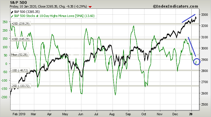
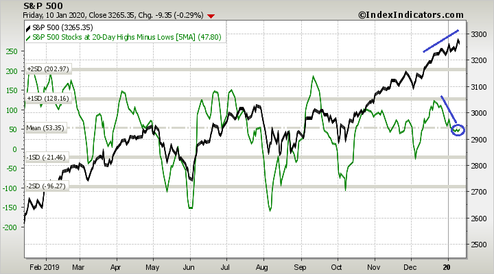
S&P 500 vs. Percentage of SPX Stocks at a 5-day, 10-day and 20-day Highs-Lows: 5-day high-low, 10-day high-low, 20-day high-low – doesn’t matter – in all cases, as the market has drifted higher, the percentage of highs minus the percentage of lows has drifted down. Nothing is extreme or urgent, but it’s worth noting a few less stocks are keeping up in the near term. More evidence of short-term deterioration.

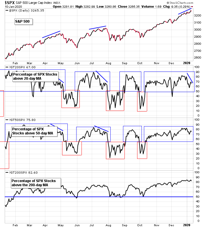
S&P 500 vs. Percentage of SPX Stocks Above 20-day, 50-day and 200-day MAs: The percentage of SPX stocks above their 200-day MAs is at a 52-week high. This indicator lags and won’t turn down with force unless/until the market drops first. The percentage above their 50’s might be in the beginning stages of a negative divergence, but it’ll take 1-2 more weeks. A divergence is already forming with the 20’s, so despite the trend being solidly up, use appropriate stops. A slight bit of weakness is forming.
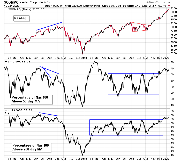
Nasdaq vs. Percentage of NDX 100 Stocks Above 50-day and 200-day MAs: The percentage of Nas 100 stocks above their 50 and 200-day moving averages are at healthy levels. They can remain up here for a while or form negative divergences – in either case time is needed before weakness seeps in.
The Bottom Line
Overall the market is in great shape. The trends are up and solid; leaders are leading; and long-term breadth is strong.
But in the near term some weakness is starting to show. The 10-day AD line has been trending lower; the mid cap and small cap AD volume lines are rolling over; the percentage of SPX stocks above their 20-day MAs is negatively diverging from the index. The small and mid caps haven’t matched the movement of the large caps, and the NYSE hasn’t kept up with the Nas. Little hints that despite the week ending with three straight all-time high prints, a few names are being left behind.
I’m only interested in the long side overall, but in the near term we need to be more selective. There are signs a pullback is looming.
Have a great week.
Jason
Thanks a lot. Learning a lot with your papers. I really don’t like the space between the price and the MAs in general. Furthermore, what looks like manageable corrections on an index graph in a bullish trend resulted in devastating drops for most of the “hip” stocks of the day. So, be prudent out there.
You are absolutely right. A relatively minor 5% drop for the S&P would probably see many of those “hip” stocks fall 20%.
Nice work!
Euphoria mode