The market is topping. These are long, drawn-out processes that often take upwards of two years to complete. Let’s compare the current topping process to the Dot Com top and Financial Crisis top.
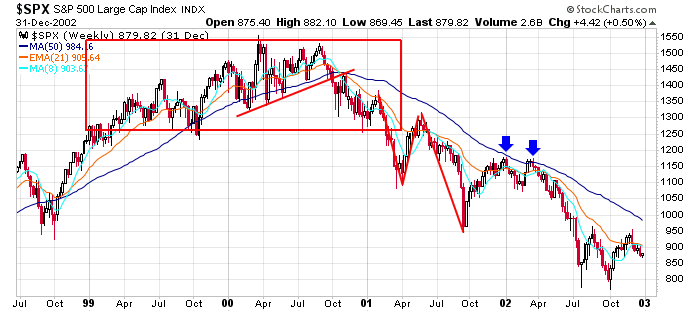
Here’s S&P 500 from 1999-2002. Even though ’99 was a great year, in hindsight, it was the start of the topping process. The high was established in March 2000 but was still approached five months later in August. An up-trend line was then broken in October, and the 50 was tested from below a few weeks later. The index didn’t break down until Q1 2001, and even then, there was a bounce attempt in Q2. At that point, the S&P was unchanged going back two years, even though a top was in place and the market had broken down. Then the market fell apart.
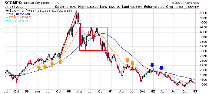
Here’s the Nas from the same time period. A nearly-100% rally was followed by a 40% drop. A range followed into Q4 2000 before the index broke down again. Notice the 21-week EMA was support on the way up in ’99 and resistance most of the way down.
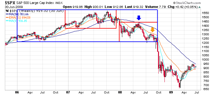
Here’s the S&P from 2006-2009. The 50-week MA was an important dividing line, acting as support on the way up and resistance on the way down. All of 2007 fits in a range. The first nine months of 2008 fits in a range at a lower level. Extending backward from the breakdown level, the entire process took more than 2 years.
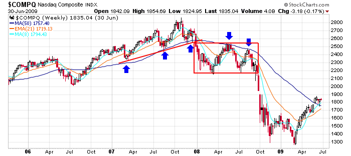
Here’s the Nas from the same period. It very closely resembles the S&P. An up-trend line was broken in late-2007 and then a range followed, with the 50-week MA acting as resistance twice.
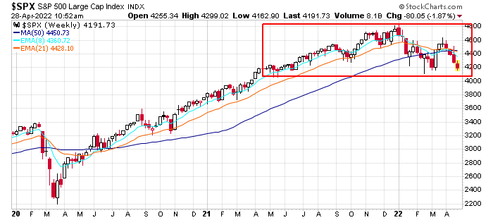
Here’s today’s SPX chart. If a minor top is in place – meaning we’ll get a 20% correction and then a resumption of the trend – we’ll get a drop to 4000 and then the usual big rally off the midterm election year low. But if a major top is forming – one that’s going to last long and fall much further – we may only be halfway through the topping process. And then there’s the intense selling on the right side of the chart that hasn’t taken place yet. In this case a drop to 4000 would be followed by a bounce to the 50 and perhaps a multimonth range before heading south again. The point being: don’t expect the current conditions to end soon. Even in the best of worlds, we have many months of extreme up and down movement ahead of us.
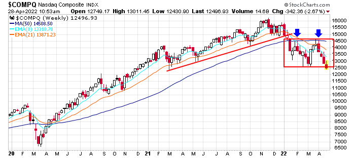
And here’s the Nas. It resembles the current S&P chart and the 2007-2008 Nas a chart. An uptrend line has been broken, and now the index is trading in a range, having been rejected once by its 50-day MA
Takeaways are: 1) tops take time to form, often more than two years; 2) there is a lot of big up and down movement along the way; 3) and even after the indexes are down quite a bit, they can still fall much further.
The market is in bad shape right now. The path of least resistance is down.
The question is: will this be a very normal, albeit painful, correction or something that more closely resembles the 50% drops we got in 2000-2003 and 2007-2007?
If you expect a normal correction, you are operating under the belief the Fed has a silver bullet it can fire to fix the current issues. In Q4 2018 they did an about-face with rates. In March 2020 they flooded the economy with money via quantitative easing.
In my opinion, those options are off the table. With inflation the highest it’s been in 40+ years, they cannot keep rates low, and they cannot continue flooding the market with money. Cutting off inflation is a higher priority than propping the market up. Because of this, their hands are tied.
Will we get a 50% correction? I’m not making that prediction. If I had to answer I’d say no. But I do think much more downside is coming.
But the path the market takes to get there is the unknown.
Jason Leavitt