(I increased the font size. Do you like it better or does it not matter? Let me know by commenting below. Thanks.)
Good morning. Happy Tuesday.
The Asian/Pacific markets closed mostly up – there were a couple 1% gainers.
Europe is currently mostly up – gains are on the small side.
Futures here in the States are green by a couple ticks – as of now it’ll be a flat open. …
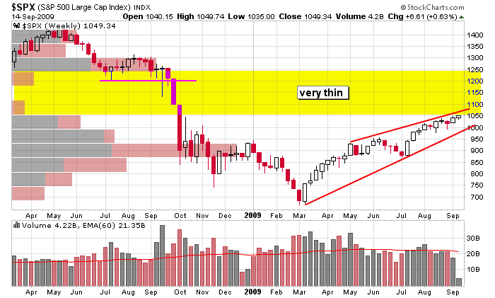
Here’s the weekly SPX. A rising wedge within an overall downtrend is right up against a very thin trading area. The wedge either resolves down or gets invalidated by melting up. There may not be much resistance overhead because since little volume took place between 1050 and 1250, there won’t be many traders/investors looking to get out even.

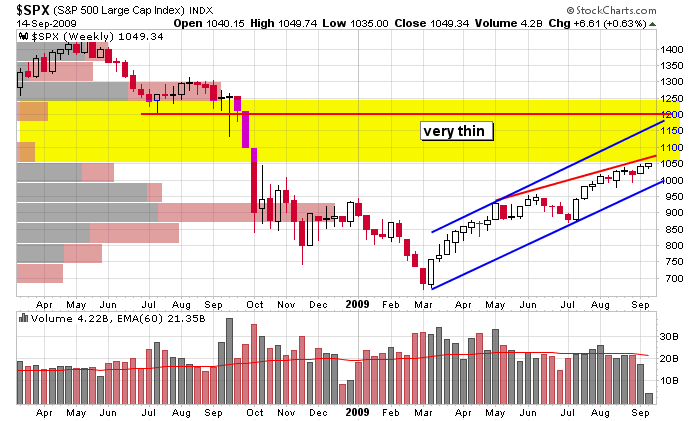
Here’s another version. A line parallel to the lower support line has been drawn through a high point in the pattern. Per median line theory, this resistance line may contain the price action, so don’t assume the index will travel entirely through the thin area. Also, if the index moves up, former resistance at 1200 may come into play (in fact if it takes several weeks to get up there, the upper blue line may cross 1200 very close to when the SPX gets there).

These are the longer term areas I’m looking at. Nothing is guaranteed, so don’t assume anything is going to happen. More after the open.
headlines at Yahoo Finance
today’s upgrades/downgrades
yesterday’s Sector Performance
this week’s Earnings Reports
this week’s Economic Numbers
open a real-time futures demo account at…

0 thoughts on “Before the Open (Sep 15)”
Leave a Reply
You must be logged in to post a comment.
Please keep the larger font size.
Thx.
LOVE THE BIGGER LETTERS; YOU MUST BE GETTING OVER 40!
ENJOY YOUR MORNING COMMENTS ALSO, THEY ARE SIMPLE
AND YOU DONT AMPLIFLY ANY MARKET NOISE…THANKS MUCH-RICH
The larger font helps.
Like the font like the website very unique interaction
The larger font is fine and the other size print was fine, too.
YES…Larger font is great.
The larger font gets my vote. Your comments are straight and to the point. I look forward to them every day and thank you.
I’m with the majority in liking the larger font.
Indeed, the larger font looks great. Please stick with it! And keep up the good work….
I like the bigger fonts.
Thanks
I like the larger font size!!!!
From an older guy the larger fonts are great.
Love the larger font.
Yes, bigger font is good. Thanks.
Larger font much better, especially for us old folks.
Dave
Great! Thanks for the thoughtfulness.
Thanks for the comments everyone. Larger size it is.
Jason