The indexes are mostly dominated by large cap stocks that trade lots of volume, so it’s possible for a small number of big companies to paint the index charts different than what’s really going on beneath the surface. The internals, or market breadth, tell us what’s going on behind the scenes. The S&P 500 may look pretty good because AMZN, GOOGL, FB, MSFT, NFLX and others are doing well, but if many less-influential stocks are doing poorly, it’ll eventually weigh on the market.
Right now the market has bad breadth. It’s been bad since the summer. Here are several indicators I follow.
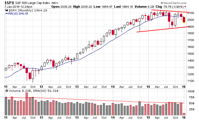
Here’s the monthly S&P chart going back 5 years. It’s not that bad. We have a huge rally followed by a big consolidation pattern which is taking the shape of a symmetrical triangle. On the surface, this a bullish continuation pattern within an uptrend…
But beneath the surface there are warnings.
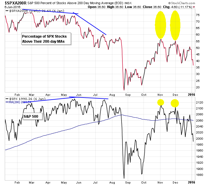
Percentage of SPX stocks above 200
At the beginning of November and December, the S&P was within 30 points of its all-time, yet only about 55% of SPX stocks were above their 200-day moving averages. This means the participation rate was low…that a small number of stocks were doing the heavy lifting while trouble was brewing beneath the surface.
Percentage of NDX stocks above 200
The situation in the Nas 100 was the same. The index was consolidating near its all-time high, but the percentage of NDX stocks above their 200-day MAs much lower than over the summer.
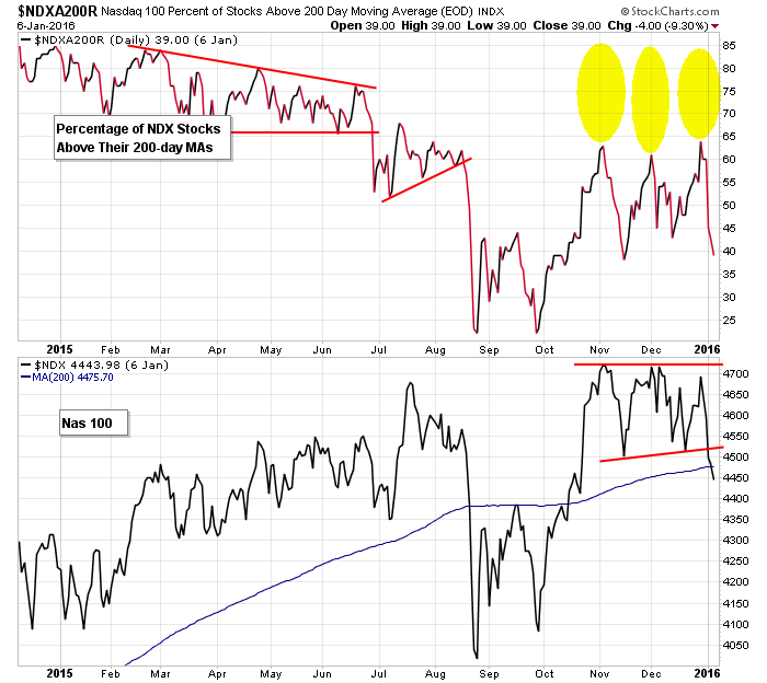
The indexes tell us to be calm…that this is just a range within an uptrend. Yet beneath the surface we’re being told a rising tide is not raising all ships…that weaker companies are not participating. This can last in the short term, but over time, it will pull the market down.
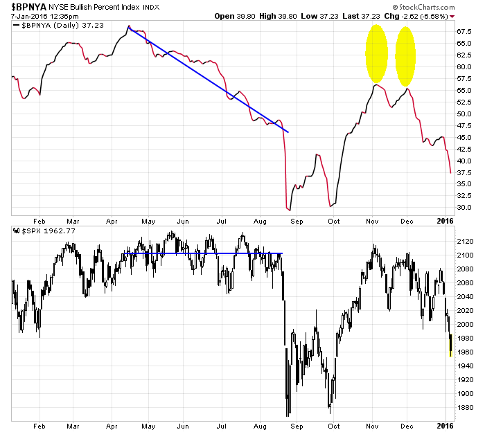
Bullish Percent Charts
Declining participation shows up with the bullish % charts too.
During the summer, while the S&P was calmly trading in a range near its high, the NYSE bullish percent chart trended down. This tells us one by one stocks were falling back while the index was propped up by a handful of out-performers.
At the beginning of November when the S&P was a stone’s throw from its all-time high, the NYSE bullish percent sat well below its spring/summer low. Again, this means less stocks participated in the October rally than had participated earlier this year.
It happened again during the late-November rally…and then again during the late-December rally. Each thrust up came with less participation.
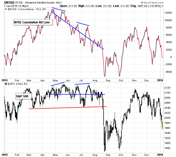
The market’s bad breadth also shows up in the cumulative AD line. When advancers are more dominant on up days than decliners are on down days, the cumulative AD line steadily moves up. Divergences that form are warnings.
Such warnings were flashed over the summer on both short- and intermediate-term bases. More recently, when the S&P was close to its all-time high at the beginning of November and December, the cumulative AD line was behind on a relative basis.
New highs
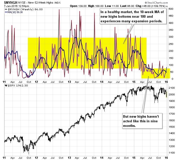
A strong market that consistently hits new highs, or at least sits near its highs, should produce a decent number of individual stocks doing the same. Non confirmation is a warning. Here’s an 18-month chart of the S&P and NYSE New Highs. Characteristic of an uptrend, notice new highs generally fluctuated between 100 and 350 (with a few spikes above and below this range), but over the last nine months new highs have mostly clocked in below 100. Also note at the beginning of November and beginning of December, when the S&P was within 30 points of its all-time high, the number of individual stocks hitting a new high was very low by the standards of a strong market.

Further evidence of the lack of new highs is the 5-year weekly chart with a 10-week MA. The consistently-low new high prints have pushed the MA to its lowest level since 2011.
After an extended downtrend, getting such negative signals would start to pound out a bottom, but we’re not near a bottom. The market hasn’t fallen that much or for very long.
In my eyes it’s a sign of trouble…that beneath the surface the market is weaker than the indexes are letting on.
Agree/Disagree? Comment below. And click here to join our email list to get reports just like this sent directly to you.
![]()

0 thoughts on “The Market Has Bad Breadth (1/12)”
Leave a Reply
You must be logged in to post a comment.
Jason Thanks for your clear thinking. I could see some weaknesses as well. What you did is put it in perspective & alerted us that this may be serious stuff coming at us.
Last week (a down equity week) I used Barrons to identify momentum stocks. I ticked all stocks on NYSE and NASDAQ that were up at least 1$ for the week and were less than 15% away from their 52 week high. The list was very meagre. My analysis is not finished but MNRO intrigues me. Car inventories are high, lot of 11 year old cars around and if we are into a recession in 3d qt, the muffler business should be good. In any case I have a lot more to do on this list. FS
Jason
I could not agree with you more on this issue. Small caps and most stocks are lagging the few leaders which for the most part have an obscene PE ratio. That said IWM is down 22% from it’s high. One wonders how much further it will go. My guess is not a lot.
This analysis reminds me of your fall 2007 where you indicated in your state of the market that something was different.
God I wish you could survey the ASX !!……Exc reporting as usual–Thanks Jason