For those of you who’ve followed my work for any length of time know I prefer breadth indicators over technical indicators, ergo I prefer the % of stocks trading above a certain MA over MACD.
Let’s do a run down of two short term S&P 500, Nasdaq 100 and NYSE breadth indicators.
The S&P 500
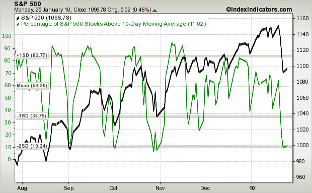
SPX (black) vs % of Stocks Trading Above Their 10-day MA (green): The correlation between a low reading from the % and the SPX can’t be denied or ignored. Each time the % dropped to two standard deviations below its mean (beginning of Sept, beginning of Oct, end of Oct), the market bottomed and moved up almost 10% before resting. The % hit this oversold reading Friday, but given the late-Oct activity, we need to be open to a mini double dip.
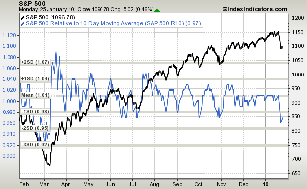
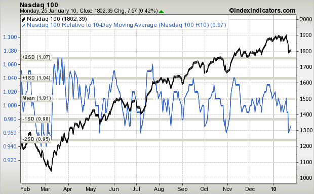
SPX (black) vs. Distance the SPX is From its 10-day MA (blue): The theory here is each time the underlying index gets “too” extended from its moving average, a regression to the mean is likely to follow. In the chart below, each time the S&P dropped to around one standard deviation from its mean (~ 0.98 on the left axis) the S&P bottomed and bounce. Study the chart. There are many instances of this going back to the Mar low.
The NYSE
NYSE (black) vs % of Stocks Trading Above Their 10-day MA (green): The green line here is almost identical to the one above. Each time the % of NYSE stocks above their 10-day MA fell two standard deviations below the mean, a sizable and playable bounce followed soon after.

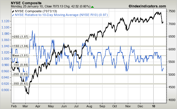
NYSE (black) vs. Distance the NYSE is From its 10-day MA (blue): Similar story here except one standard deviation is less meaningful. Each time the green line bottomed, the NYSE was finished selling off and a new mini leg up began.
The Nasdaq 100
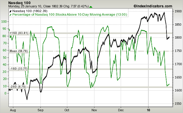
NDX (black) vs % of Stocks Trading Above Their 10-day MA (green): Ditto here. Within an uptrend, the mean % of stocks above their 10-day MA is around 60, and two standard deviations below the mean (around 10) seems to be a key level.
NDX (black) vs. Distance the NDX is From its 10-day MA (blue): Same story here. The bottoms of the green line match up very closely with the bottoms of the NDX.
Conclusion: The sum of these charts tell us, on a short term basis, the market is oversold and due for a bounce (not just a dead cat bounce, a real bounce). But I don’t want to pinpoint a bottom, I don’t want to be that exact. The market is too complex to expect it to act accordingly on a specific day, so I’ll generally say a bottom, or a double dip bottom, should take place in the next couple days. Failure to materialize may suggest a change in character is underway.
0 thoughts on “Short Term Breadth Indicators”
Leave a Reply
You must be logged in to post a comment.
Very good analysis. I have not seen the data presented in this format. Of course, as soon as people understand and see a trend like the one above, or the H&S pattern breakdown from August, they tend not to work anymore. Is it this time on the indicators above? Not sure if everyone sees this or not…yet!
Great job, Jase.
Interesting – will see how it pans out.
Jason this is excellent analyses. My indicators show a bottom as well unless there is a significant gap up the AM which appears unlikely at this moment.
Whether the indicators work again will go a long way towards suggesting a continuation of the uptrend of end of the uptrend. I like to say: “while in an uptrend, low readings from the % of stocks above their 10-day produced a bottom, so if this stops working, the uptrend may be over.”
Nice, interesting and different sort of a look at things. One thing however, I would like to see the analysis done over the last 15yrs (over several bear markets) not just this bull market (since March/2009). By definition, there will come a time when there is no bounce (or at least the bounce is negligible followed quickly by further decline) because the market will continue to correct (decline). So what do these looks tell us about that ?
Hi George,
I would not expect the indicator to work as well within a downtrend.
This creates somewhat of a backwards analysis. If the indicator works, that means we’re still in an uptrend. If it doesn’t work, the uptrend is no longer in place.