We entered this past week with the market being in a nice rally (the S&P had moved up 4 consecutive days and 7 of the previous 10, and the Russell had moved up 9 of 10 days), but the indexes were in no-man’s land. Support and resistance were a couple % away, and the risk/reward was no longer favorable for new longs (despite there being some good long set ups to consider). What did we get? A pause day Monday which did not take out the previous day’s high and then semi intense selling Tuesday and Thursday. Rallies Wednesday and late Thursday recovered most of the losses, and by Friday’s closing bell, the indexes were down less than 1% for the week. Not bad considering the situation when the week began. The index charts told us to lay low. They told us the risk/reward wasn’t favorable. We just needed to listen.
Trading is so much more than just picking good stocks. It has much to do with knowing when to trade and when to sit. You’ve heard me say many times the same pattern appearing in two different markets will produce two different results. Said another way, a breakout at the beginning of a rally has very high odds of doing well, but that very same breakout after the market has already rallied several percent has much lower odds of playing out.
Two weeks ago we had some average set ups (HPQ for example) that did great. This past week we had much better set ups that didn’t fare as well. Recognizing the market conditions is half the battle because trading is a game of odds. We never know what is definitely going to happen, but we can determine if the conditions are conducive to aggressive trading of if we should lay low.
After a week of trendless movement, let’s see what the charts now reveal.
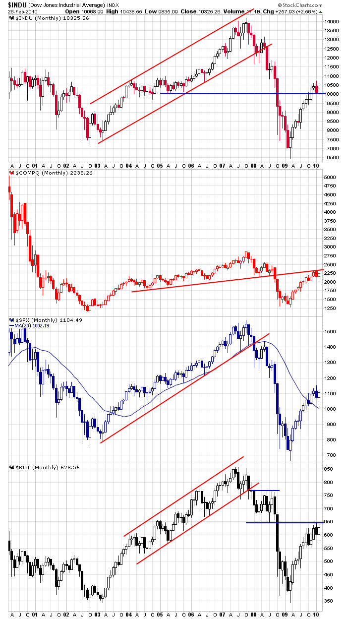
The Monthlies: February is in the books. It was a decent up month – especially considering the first week was very weak. For what it’s worth, the Dow successfully tested 10K, and it doesn’t seem to have much resistance until 11K. But the Nas and Russell are both under trendlines that have proven tough to conquer. The move off the Mar low is steep; 10 of 12 up months will be tough to build on; how much longer can it last?
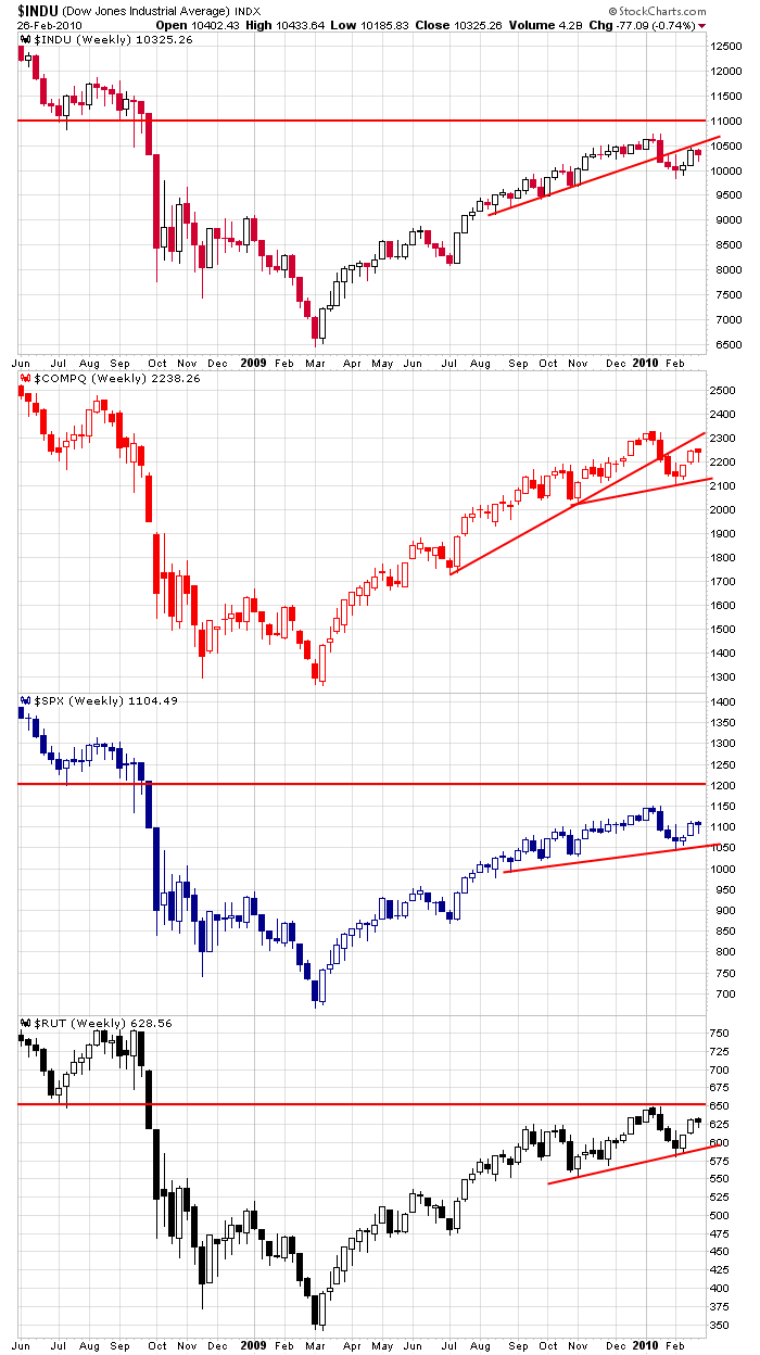
The Weeklies: The weeklies weren’t very telling last weekend, and since last week was a below-average range week with very little net change, nothing changed. The Dow may have resistance just above 10.5K; the Nas is sitting between two trendlines; the SPX may have resistance at the recent high, but much stiffer resistance doesn’t come into play until 1200; the Russell will have a tough time with 650. In all, other than the Dow, there is no front-and-center resistance to deal with early next week.
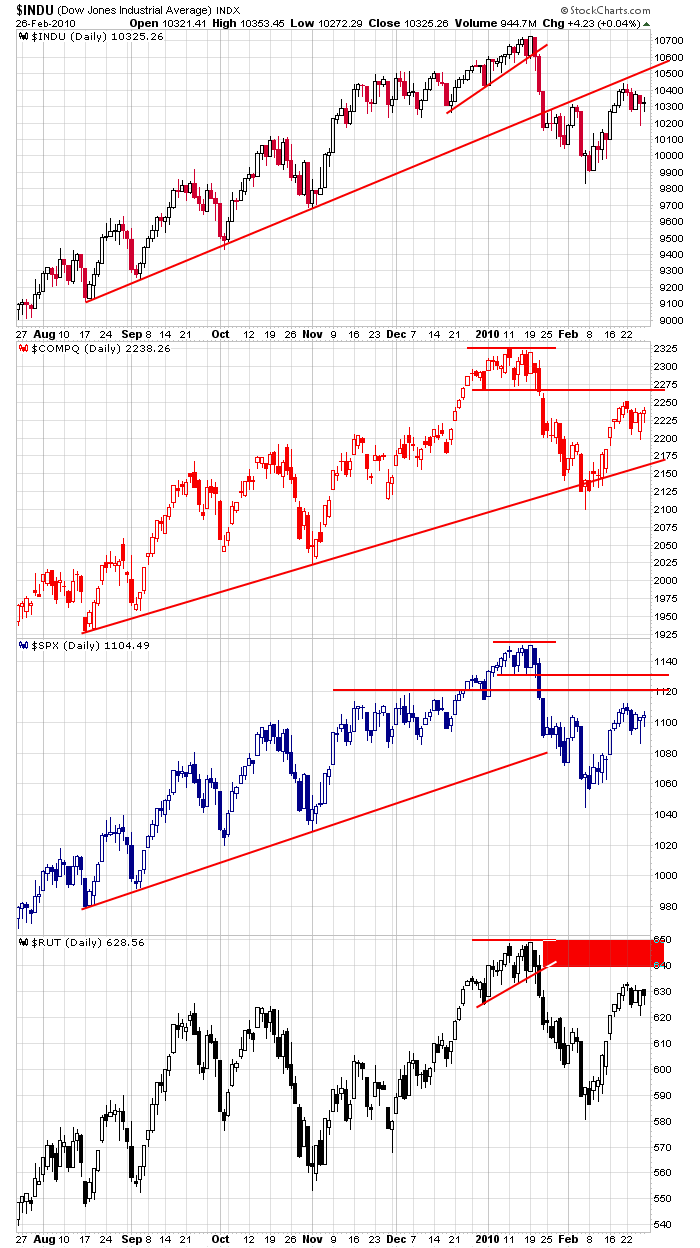
The Dailies: After a nice run up from no-man’s land, the indexes chopped in place last week. Losses Tuesday and early Thursday got recaptured, and all the trendlines from the previous week remain in place. Focusing on the S&P, I see potential resistance at 1120, 1130 and the high. That’s what happens after a stiff sell-off – several resistance levels are put in place. But you can see the previous rallies (early Sept, early Oct, early Nov, late Nov) – each went up and up and up and paid no attention to previous trading.
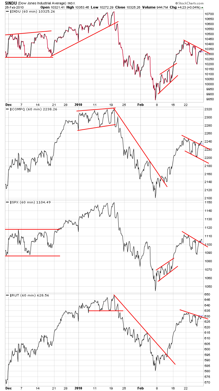
The 60-min Charts: They give a better picture of last week’s movement. In all cases we have falling patterns within short term uptrends. These are bullish, but you can see the rising patterns within the downtrends (Feb 8-16) which did not resolve down. When I stand back and look at these charts, I see indexes trading at approximately the midpoint of their most recent high and low. This is neutral.
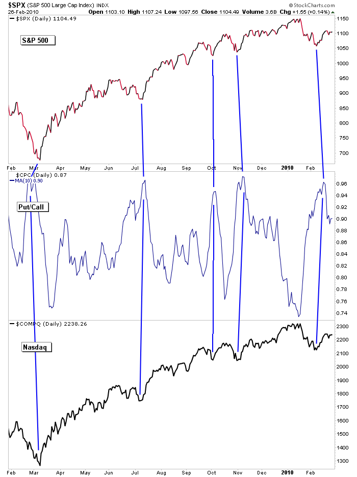
S&P 500 and Nasdaq vs. 10-day MA of Put/Call: Three weeks ago the put/call moved to a level that has signaled bottoms of pullbacks, and as of now, the market is acting exactly the same as it did the previous four such occurrences. Failure to at least test the highs would imply a change in character for the market. For now, all is good, but the market still can’t rest.
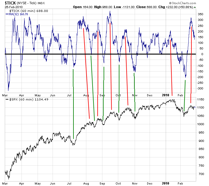
S&P 500 vs. 32-MA of TICK: This indicator suggests we have some downside or at the very least, more sideways trading to work off an overbought condition. When the 32-MA of the TICK on the 60-min chart reaches an elevated level as shown and rolls over, the market tends to correct temporarily.
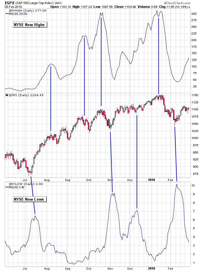
S&P 500 vs. the 10-day MA of NYSE New Highs and New Lows: When new highs rally and then roll over, the market rolls over too. When new lows rally and roll over, the market reverses its correction. Right now we don’t have a spike in either, so we can’t depend on extreme sentiment in one direction or the other helping us determine the market’s most likely next move.
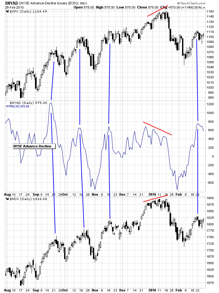
S&P 500 vs. the 10-day MA of NYSE Advancers-Decliners: This indicator also suggests more downside or at least some sideways movement is needed to work off the overbought condition. When the NYSE AD moves to an elevated level and then rolls over, the market corrects.
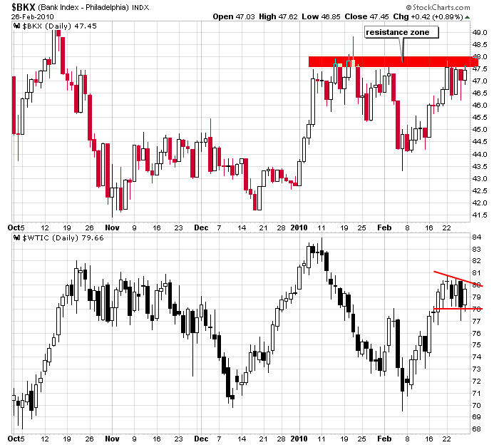
Banks and Crude Oil: These are two charts I’ll be watching next week. They both consolidated last week, and their next move – whether it confirms or contradicts the overall market – will be telling.
The Bottom Line:
The index charts are in decent shape. The longer term time frames (going back many months) suggest the uptrends are firmly in place while the shorter term time frames are a little more neutral. We got a decent move off Jan high and now a pretty good move off the Feb low. Currently the market is resting. My bias remains to the upside.
But there are a few breadth indicators which are neutral and are not going to help rally the market from here. Off the lows, it’s easy to rally because sentiment gets so stretch in one direction. But that sentiment has neutralized, so it’ll take real buying – not just short covering – to move the indexes up from here. And several other breadth indicators tell us a little downside or at least some sideways movement is needed to further work off the recent overbought condition.
Overall the market is in good shape, but I’d prefer a little more time before the next leg up is attempted.
Have a great week.
Jason Leavitt
14 thoughts on “The State of the Market”
Leave a Reply
You must be logged in to post a comment.
Sure appreciated your lot of time and hard work
You’re welcome. 🙂
Excellent recap. Saved me lots of time. Good analysis-agree with every point you made.
Best technical analysis I have ever seen!
Thanks, I very much agree there is a stand-off. The technical and fundamental data are hung up on the international, and national, debt actions.
If Greece (read EU) is not resolved, horrendous implications will follow, the US debt bombs are equally threatening as are the implications of this health bill which may come due, it could depress the market for years. I am also concerned over CA with its lack of action, and dodges on paying its public debt. This alone could tip the balance.
I liked your opening there are times traders are better spectators. I still have a few orders ready if we get any positives. I like technology, but only as an etf for right now. I also open a portfolio of bonds (ST, IT) just in case things go south, which I think is the long run direction of the next break in 2010, too much bullishness since 2010 opened.
The problem I have with looking at a list of negatives is that most of them have existed for a while and the market just ignores them. In the end I’ll just trade the charts as they unfold because even though I know the market will go down, I have no idea when. 🙂
I always appreciate your perspective, and rank it very high with a few Stockchart pundits and EWI.
For perspective on distressed nations (called “PIIGS” nations) and growth nations (called “BRIC” nations), refer to these nations are ranked in descending order by 2009 GDP @ GDP in $Billions US # 1 @ $14,300B; Japan # 2 @ $5,100B; China # 3 @ $4,800B
Note: Germany # 4 @ $3,200B is supposed to bail out *Greece # 28 @ $338B (see article below)
Distressed “PIIGS nations:
Portugal # 38 @ $220B
Italy # 7 @ $2,100B
Ireland # 37 @ $227B
*Greece # 28 @ $338B
Spain # 9 @ $1,400B
Growth BRIC nations:
Brazil # 8 @ $1,500B
Russia # 11 @ $1,300B
India # 12 @ $1,200B
China # 3 @ $4,800B
Market marginally in “good shape” due to Dem’s continued failure to dilute dollars by expanding spending on healthcare and additional bailouts. Strong dollar means US treasuries provide best alternative to EU and other nations seeking safety. Good for bonds. If oil futures “traders” start dumping, good for stocks. Good for the return of a healthy US private sector and concumer spending – though not as rampant as in the “good old days” before 2007. BUT, if healthcare passes, expect major market drop (see Prechter’s bearish 3-of-3).
allot of confluence between tech and fund. seems like we need somp’n to happen to shake it back into trend again. thanks so much for your work…
good stuff as always. I use the same charts and might add the NYSI chart http://stockcharts.com/h-sc/ui?s=$NYSI
The traders I talk to are in similar wait and see modes. They did deploy cash the end of the last week and waiting to do more which leads me to believe we will be more range bound for a bit with a positive bias short term until more cash is deployed. I think the longer term story is many of the traders I talk to have been hoping for a pull back to get more long for months now. Everyone is kicking themselves for not picking up stocks on the cheap last march like F at $1. So to frustrate everyone we never get it until everyone is fully invested again like the first of January.
Tony you and I must talk with the same traders. Sooo many wish they would have scooped up cheap shares a year ago. If they did, they wouldn’t be trading any more; they’d be off on their own island somewhere.
ODP (Office Depot)…50 cents to 7.50…how ’bout a 15x return. 🙂
Tough market to call…..
Appreciate your analysis Jason!
MOST EXCELLENT THANKS